UI Packs
Neon Panel UI Kit — bracket-cornered panels and buttons
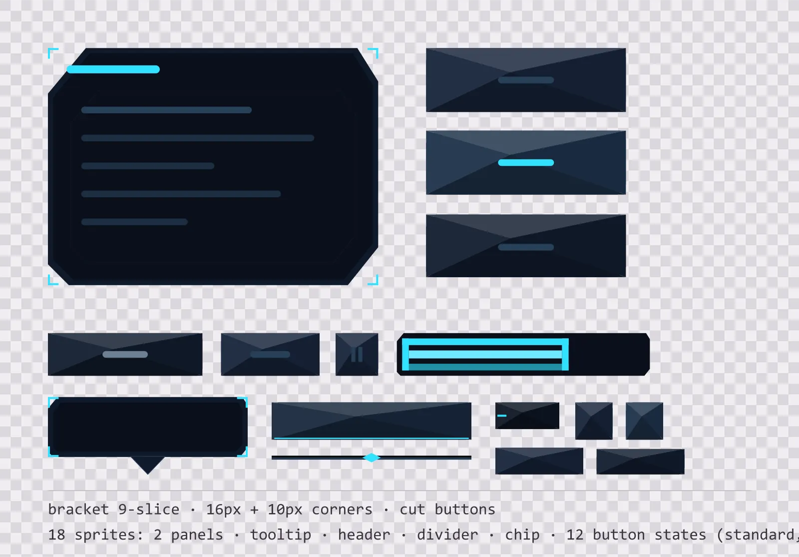
18 high-contrast neon interface sprites: bracket-cornered panels, tooltip, header, divider, chip and twelve chamfered button states.
About this pack
A sci-fi console kit built on cut corners and open frames. There is no continuous border anywhere — four corner brackets mark the bounds and the rest stays open, which is what makes a HUD read as an overlay on the world rather than a window covering it. Chamfers do the rest: they read as machined metal where a border radius reads as a mobile app.
Two nine-slice panels — a bracket-cornered window frame with 16 px corners and a recessed inset frame with 12 px corners — cover almost every box a menu needs: dialogs, inventory grids, list backgrounds, tooltips and stat panels. There is no continuous border at all — four corner brackets mark the bounds and the rest is open, so the panel frames content without boxing it in. Both stretch cleanly to any size because the corners never scale and the centre is a flat fill.
On top of the panels sit twelve chamfered button sprites: default, hover, pressed and disabled, each drawn three times — a standard 144×36 bar, a square icon button and a compact button for toolbars and inline actions. The three sizes are separate files rather than one scaled sprite because the drawing is size-dependent: the chamfer computed at 36 px is recomputed at the smaller ones, not shrunk. The pressed state drops its face two pixels and removes the top highlight rather than just darkening, which is what makes a button feel clicked rather than merely recoloured.
Four smaller parts cover what a menu needs between the panels: a tooltip with a pointer tail, a header bar that sits along the top of a panel, a section divider with a centre mark, and a label chip for counts and status tags. None of them are the window panel at another size — a nine-slice already stretches to any size, so a second file at a different width would be filler rather than a component.
Everything ships twice. The SVG sources are the files the kit was drawn in — open them, change the six deep space blue tones or the single cyan accent, and re-export. The PNG exports are flat, transparent and pre-scaled at 1x, 2x and 4x for engines that want bitmaps, with no premultiplied alpha and no baked-in shadow outside the sprite bounds.
Download
Direct link · no sign-up · no wait pageComplete kit — SVG sources, PNG exports at 1x/2x/4x, licence and readme

How to use it
- In Unity, import the PNGs, set Texture Type to Sprite (2D and UI), and set the border to 16, 16, 16, 16 for the window panel and 10, 10, 10, 10 for the buttons; then set Image Type to Sliced on the UI component.
- In Godot 4, use a NinePatchRect and set the patch margins to the same numbers, or drop the SVG straight in and let Godot rasterise it at the scale you set in the import options.
- In Unreal, import as a Texture2D, create a Slate Brush with Draw As set to Box, and enter the margin as a fraction of the texture size — 0.14286 for the 112 px panel and 0.06944 for the 144 px button.
- For crisp results at non-integer UI scales, use the 2x or 4x PNG rather than upscaling the 1x, or point your engine at the SVG source and let it rasterise at the final size.
- The corner brackets are the only border, so the panel needs a readable background behind it — over a bright skybox, drop a 40% black plate underneath rather than thickening the brackets.
License
Creative Commons Attribution 4.0 — Free for commercial use. Credit required. Full terms · What this means in practice
"Neon Panel UI Kit — bracket-cornered panels and buttons" by Oğuzhan Girgin, licensed under CC BY 4.0 — https://www.colorosse.com/assets/2d/ui/neon-panel-ui-kitAlso browse
More UI Packs
See all →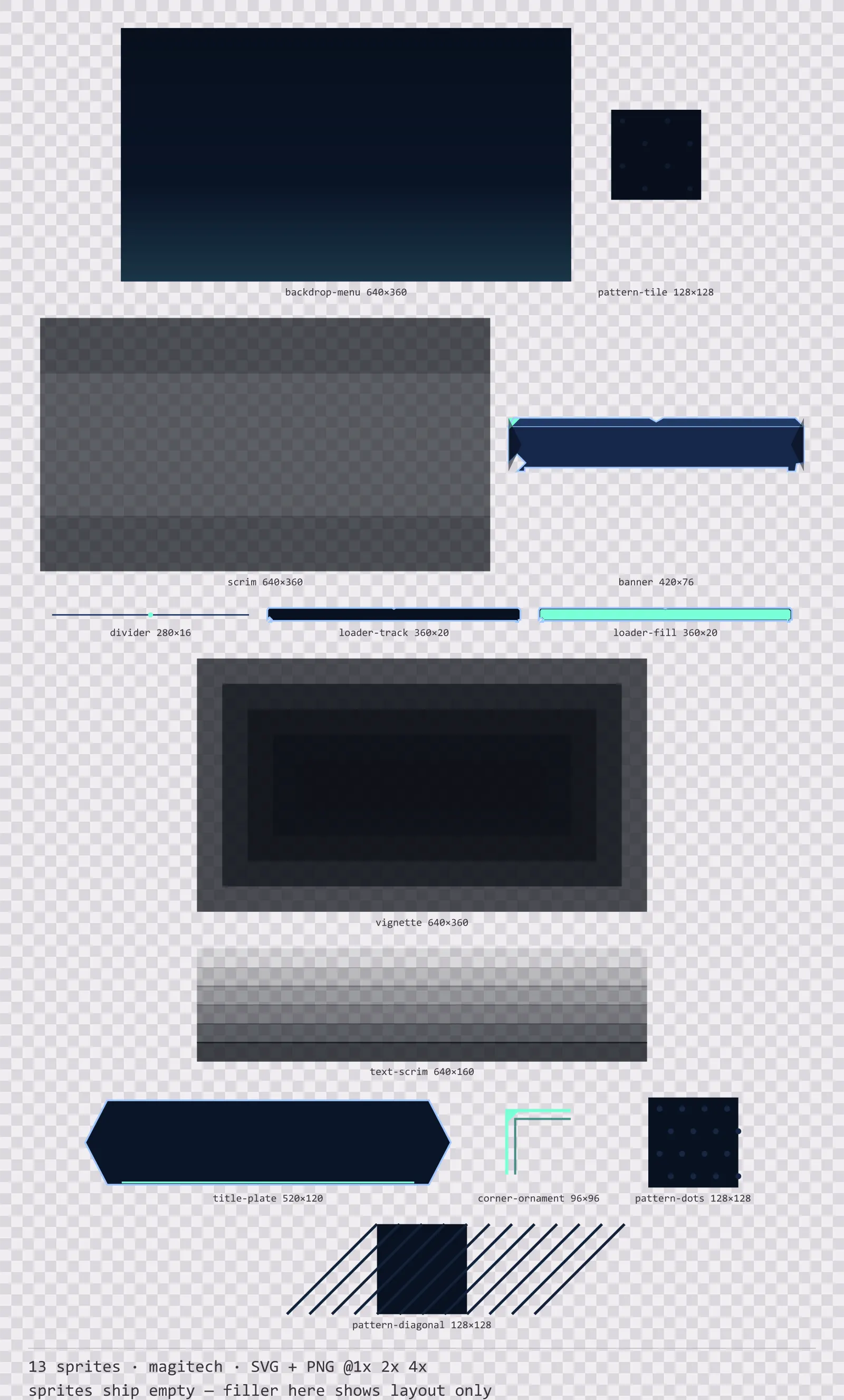
Aetherlab Backdrops
13 magitech background and overlay pieces for dark interfaces — lab navy with aether cyan accents. SVG plus transparent PNG at 1x, 2x and 4x.
Aetherlab Card Frames
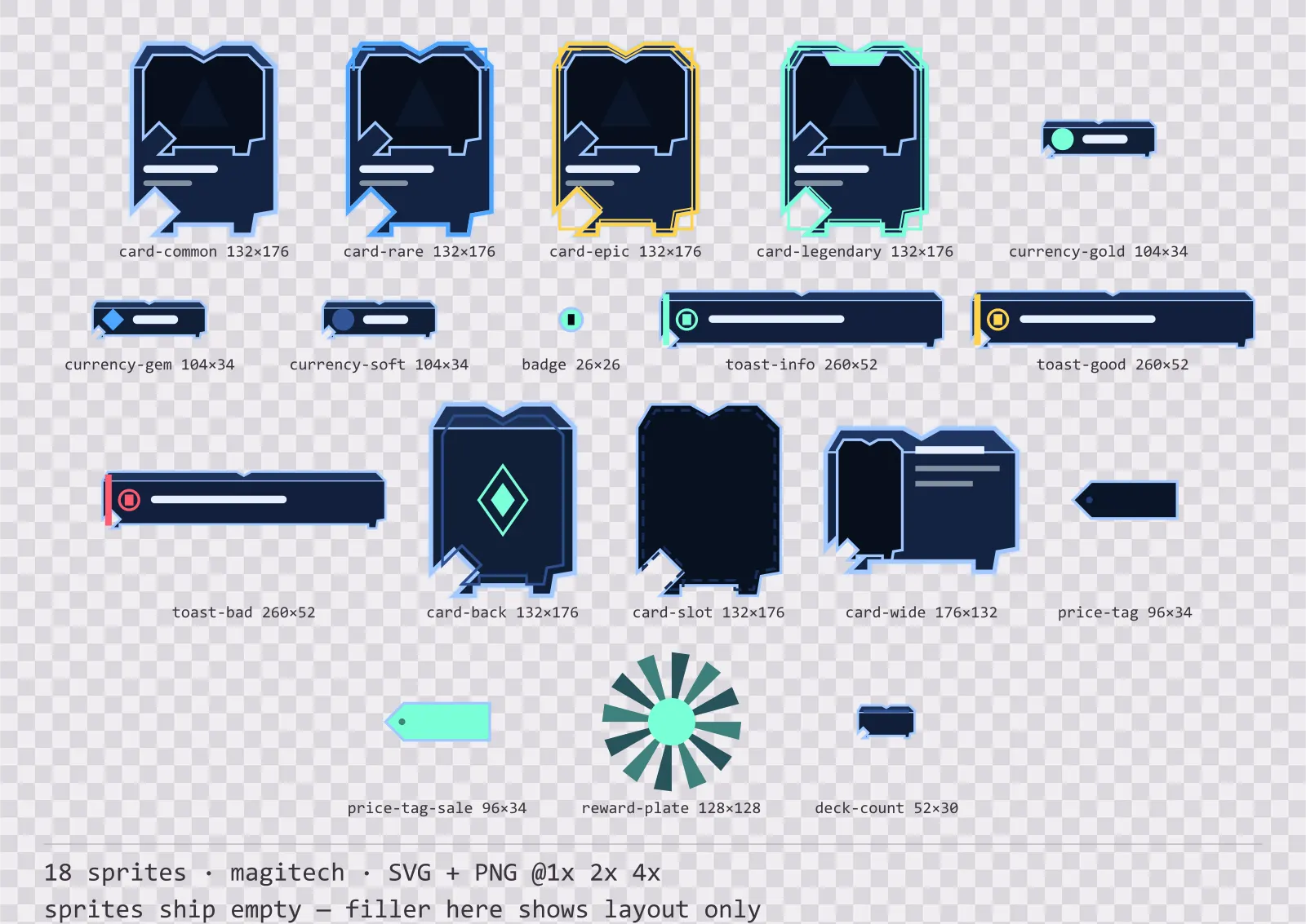
18 magitech card, currency and notification components for dark interfaces — lab navy with aether cyan accents. SVG plus transparent PNG at 1x, 2x and 4x.
Aetherlab Character Sheet
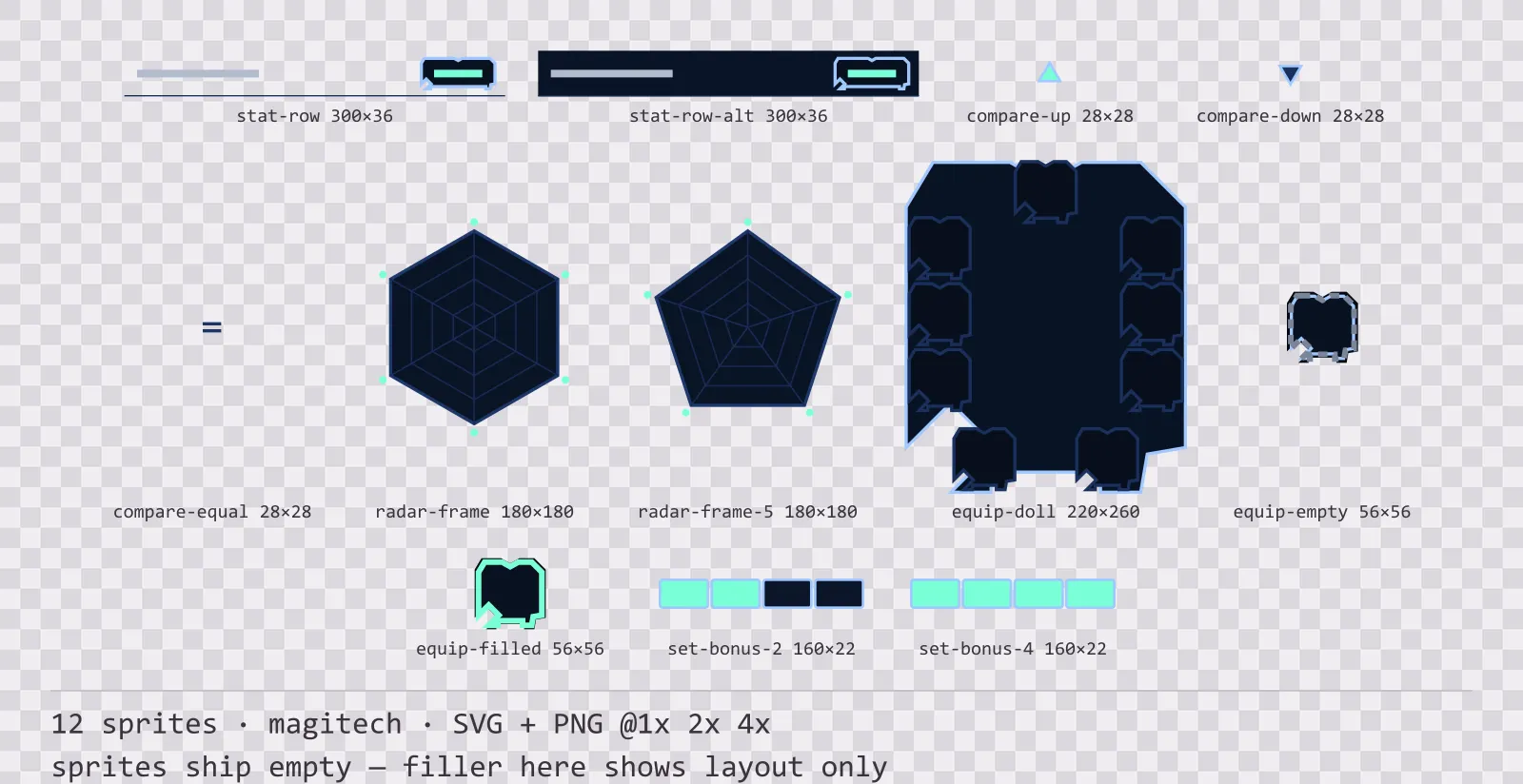
12 magitech character sheet and stat widgets for dark interfaces — lab navy with aether cyan accents. SVG plus transparent PNG at 1x, 2x and 4x.
Aetherlab Crafting UI
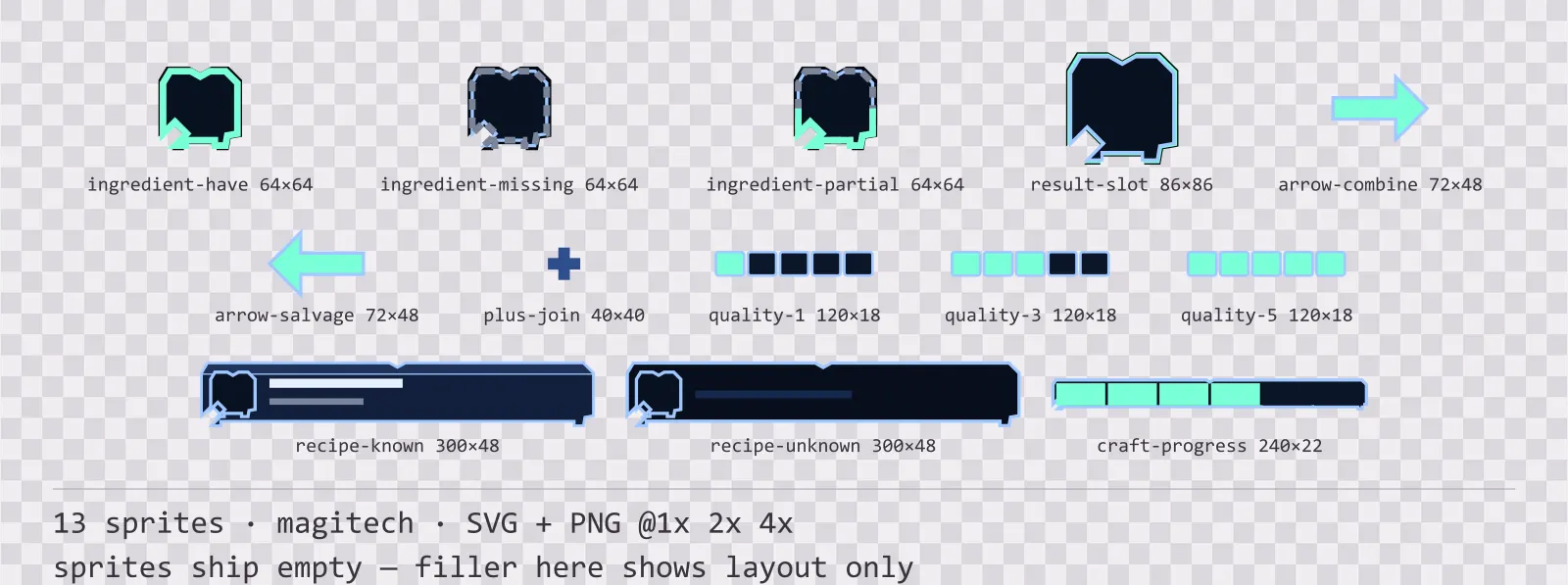
13 magitech crafting and recipe widgets for dark interfaces — lab navy with aether cyan accents. SVG plus transparent PNG at 1x, 2x and 4x.