Pack · 28 assets
Hologrid UI Starter — 28 matched kits
The Hologrid family in one place: HUD frames, nine-slice panels and buttons and 26 more matched kits. One palette, one stroke weight, one set of nine-slice margins.
Twelve projected-light HUD frames with a thin trace and a wide halo. The opposite reading of the same engine as Nightcity: where that one is heavy and filled, this one is mostly empty space.
28 kits drawn against the same rules, so they can sit in the same screen without anything looking borrowed: the same six abyss navy tones, the same single signal amber accent, the same 1.5 px stroke weight, and nine-slice margins that are always a multiple of four.
That consistency is the actual point of a pack. Individually each kit is useful; together they mean a pause menu, a HUD and a settings screen can be assembled in an afternoon without a single colour or corner radius being negotiated twice.
Each kit is downloaded from its own page — that way you take only what you need, and the file list, sizes and licence stay accurate per item rather than being averaged across a bundle.
What is inside
28 kits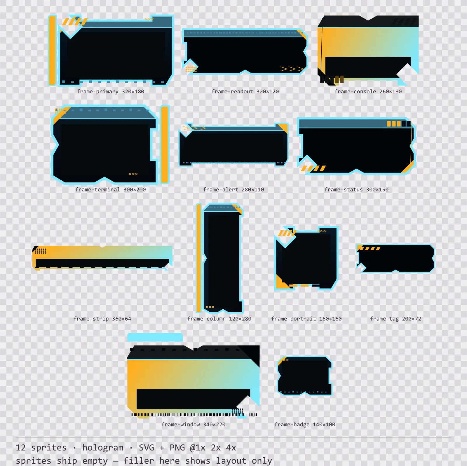
Hologrid HUD Frame Set
12 hologram HUD frames for dark interfaces — abyss navy with signal amber accents. SVG plus transparent PNG at 1x, 2x and 4x.
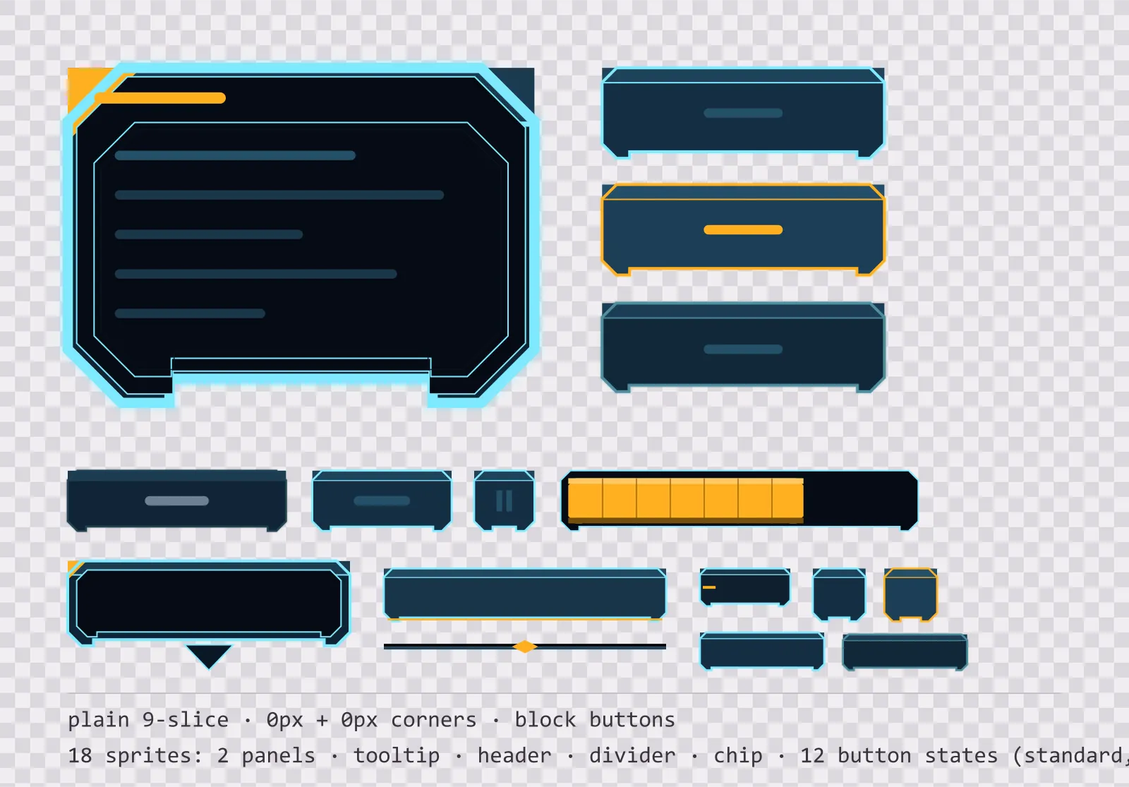
Hologrid Panel UI Kit — single-framed panels and buttons
18 projected light interface sprites: single-framed nine-slice panels, a tooltip, a header bar, a divider, a chip and twelve square button states. SVG plus transparent PNG.
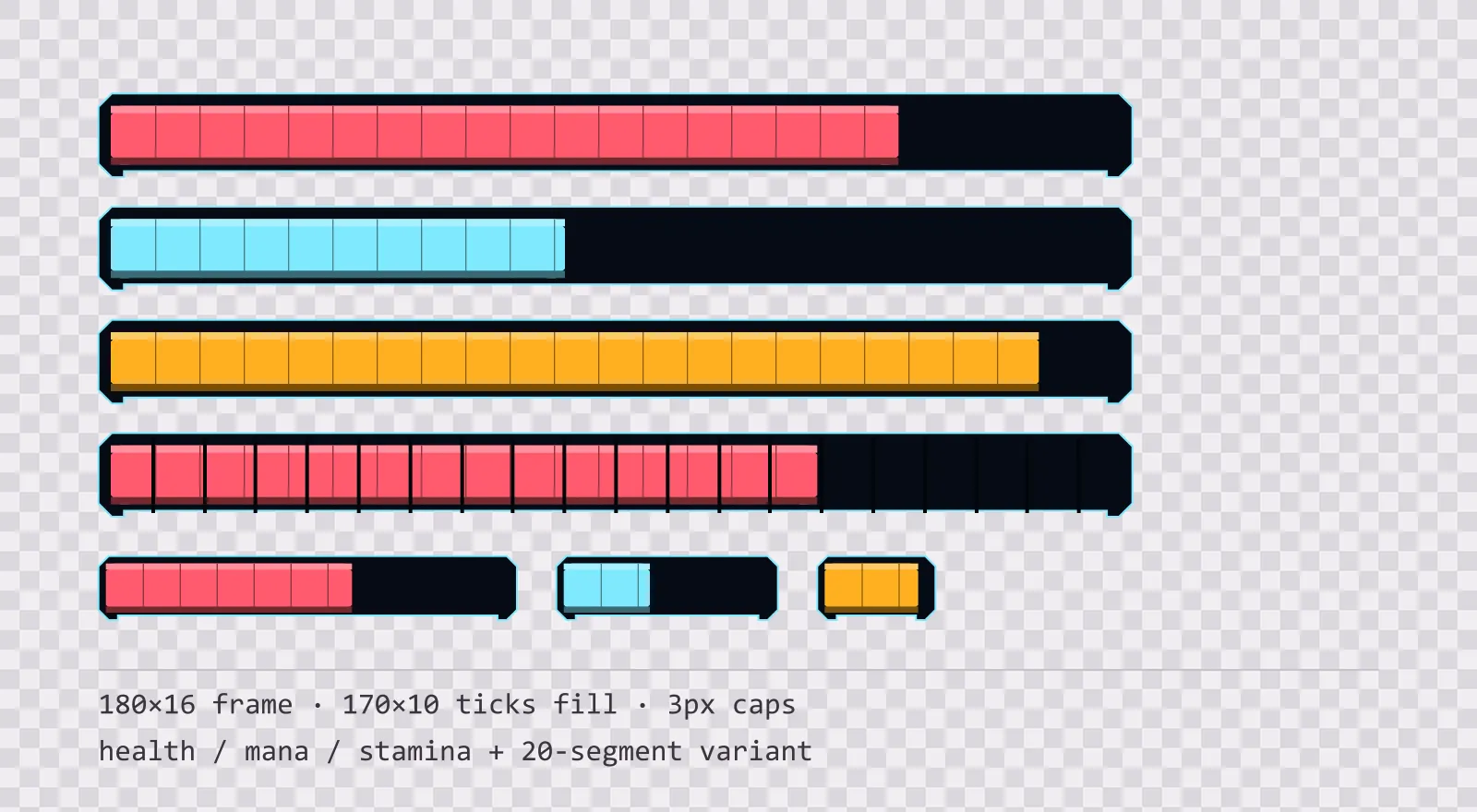
Hologrid HUD Bars — health, mana and stamina
16 projected light HUD bar sprites: standard, slim and vertical frames, three ticked fills in each, plus segmented, ghost and shield variants. SVG plus transparent PNG.
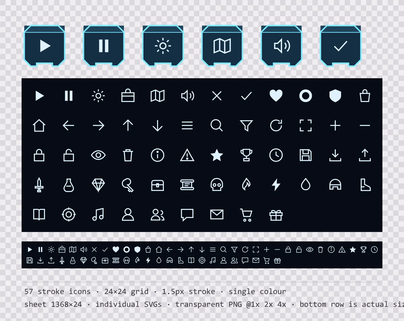
Hologrid Menu Icons — 24px outlined set
57 single-colour outlined projected light menu icons on a 24×24 grid, including play, pause, settings and 54 more. Sheet plus individual files.
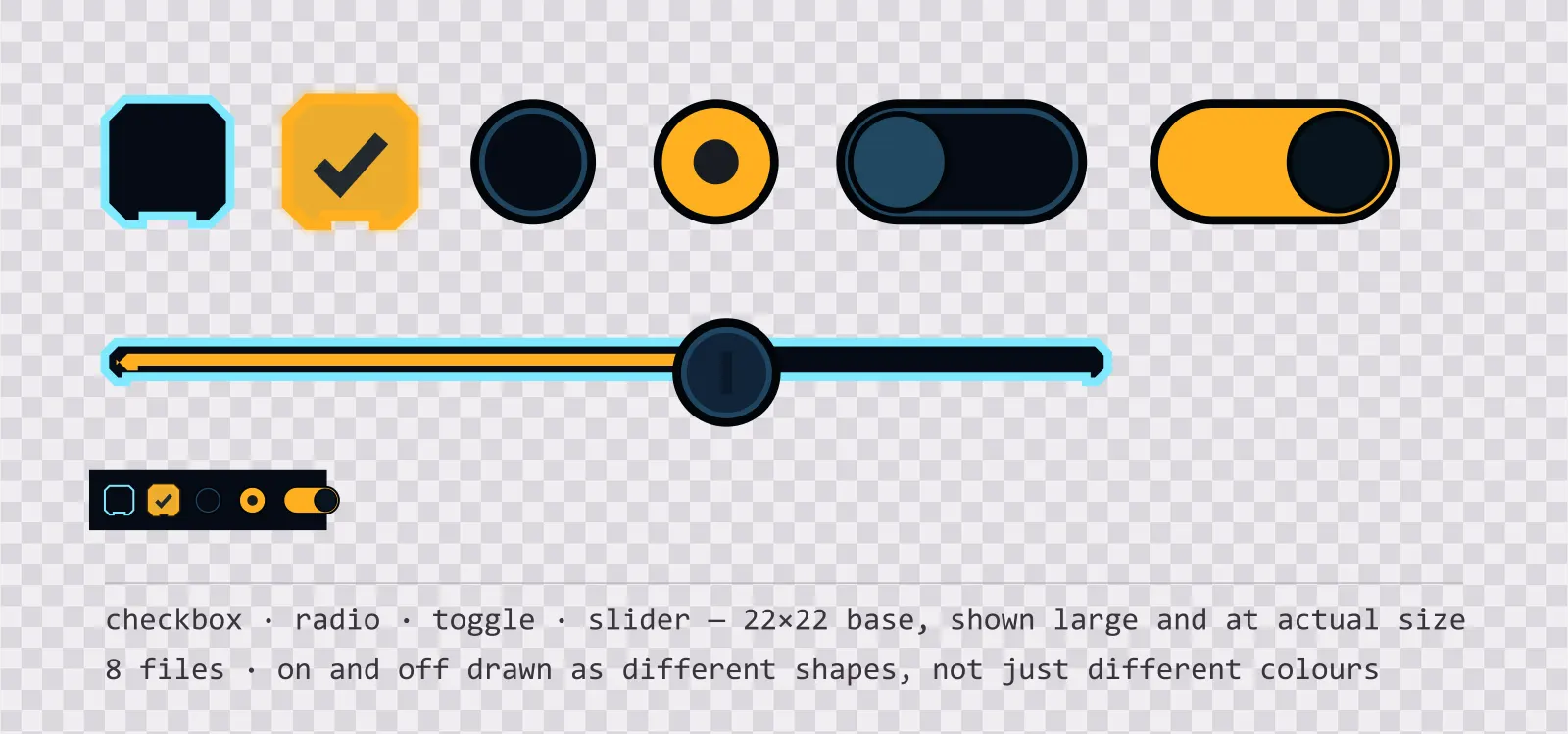
Hologrid UI Controls — checkbox, toggle and slider
19 projected light interface controls: checkbox, radio, toggle, slider and stepper, with on, off, partial and disabled states drawn as different shapes. SVG plus PNG.
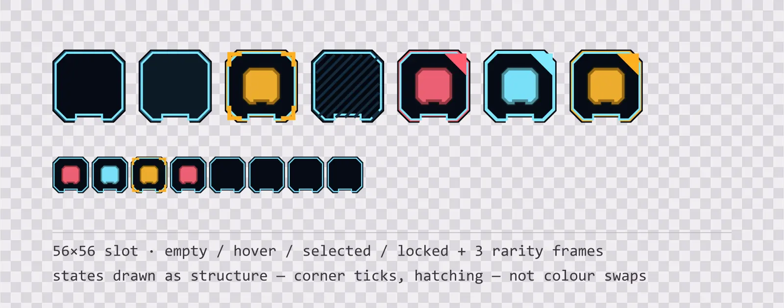
Hologrid Inventory Slots — 56px grid
13 56×56 projected light inventory slots: empty, hover, selected, locked, blocked and drop states, round and hex equipment slots, a hotbar slot and three rarity frames.
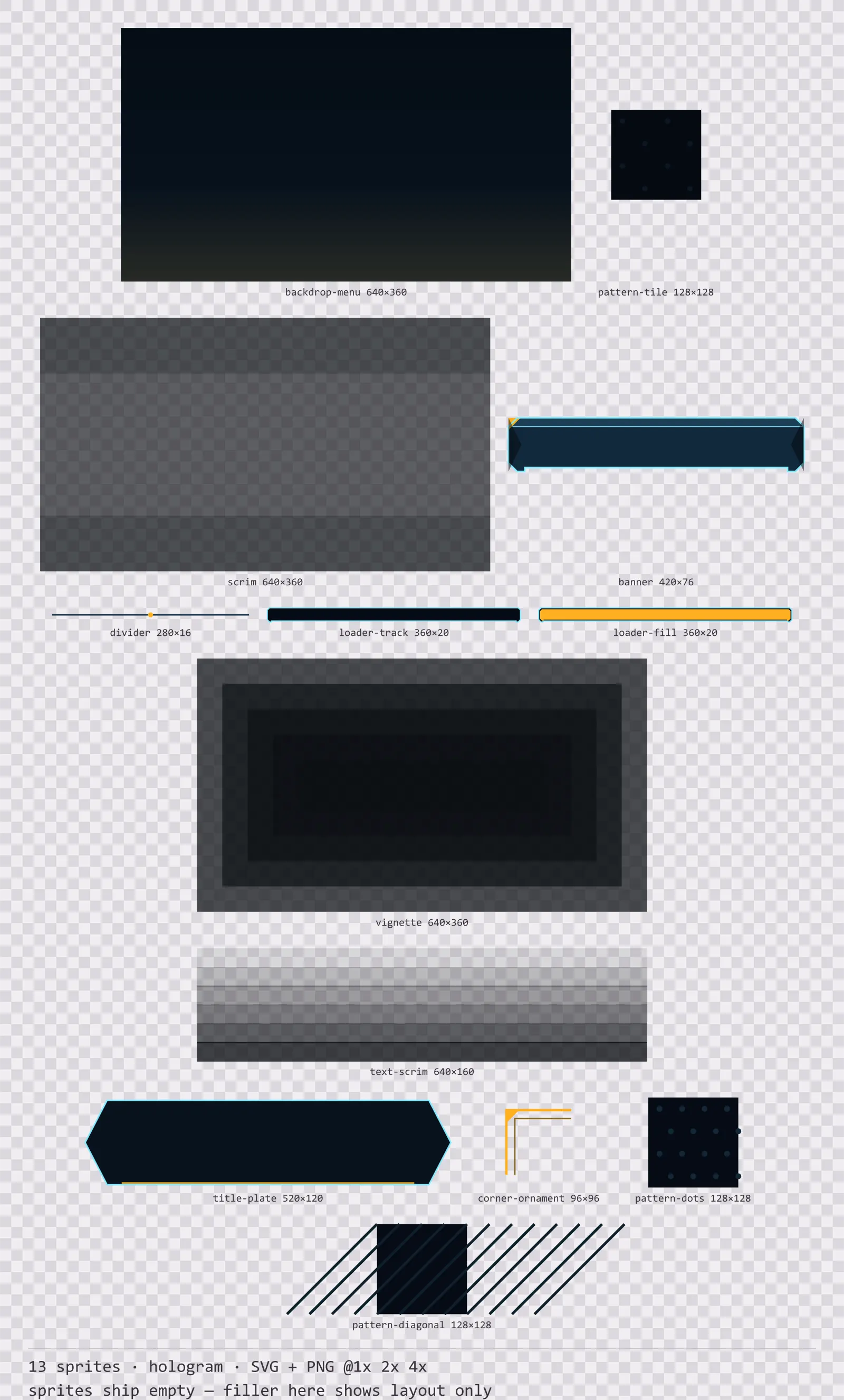
Hologrid Backdrops
13 hologram background and overlay pieces for dark interfaces — abyss navy with signal amber accents. SVG plus transparent PNG at 1x, 2x and 4x.
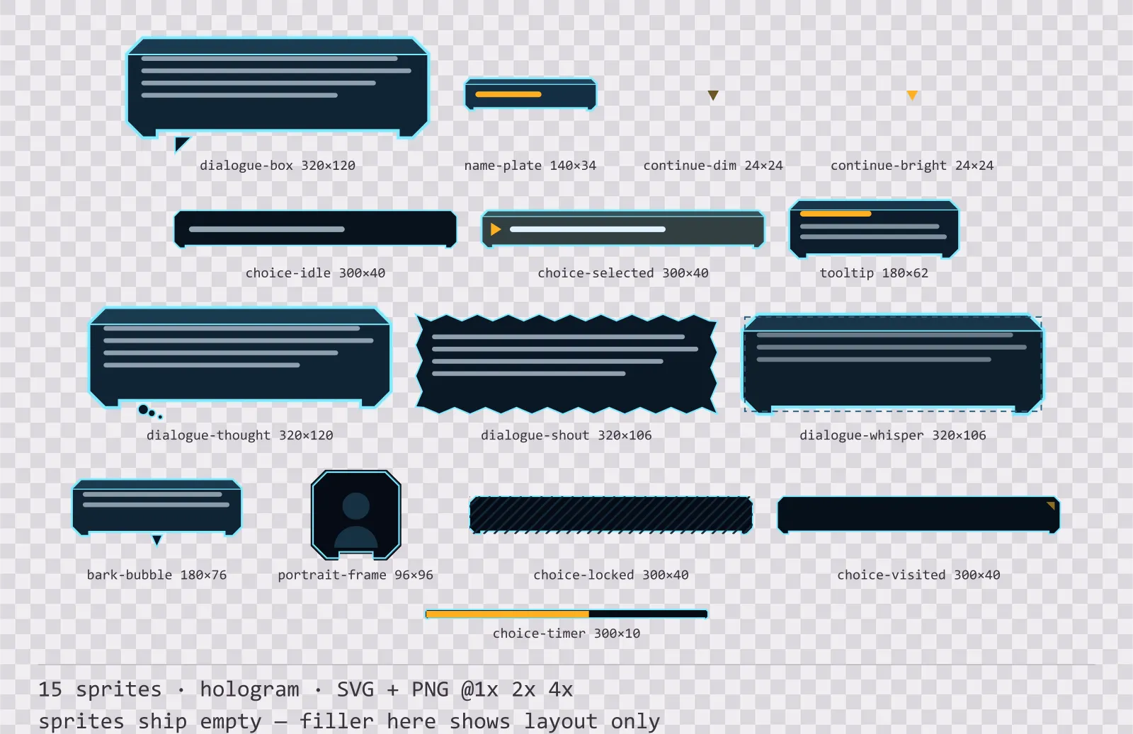
Hologrid Dialogue Kit
15 hologram dialogue components for dark interfaces — abyss navy with signal amber accents. SVG plus transparent PNG at 1x, 2x and 4x.
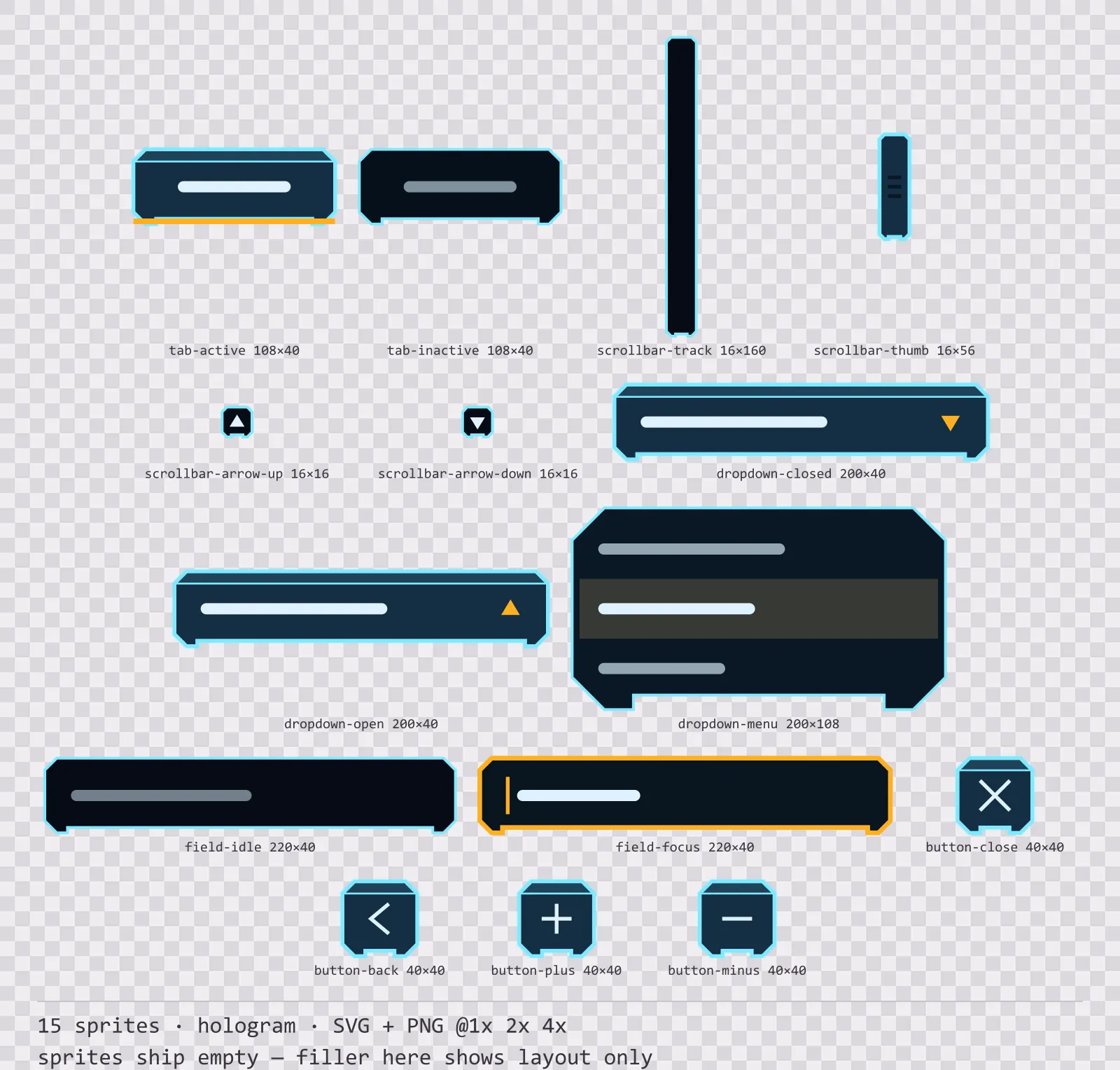
Hologrid Navigation Kit
15 hologram navigation and input components for dark interfaces — abyss navy with signal amber accents. SVG plus transparent PNG at 1x, 2x and 4x.
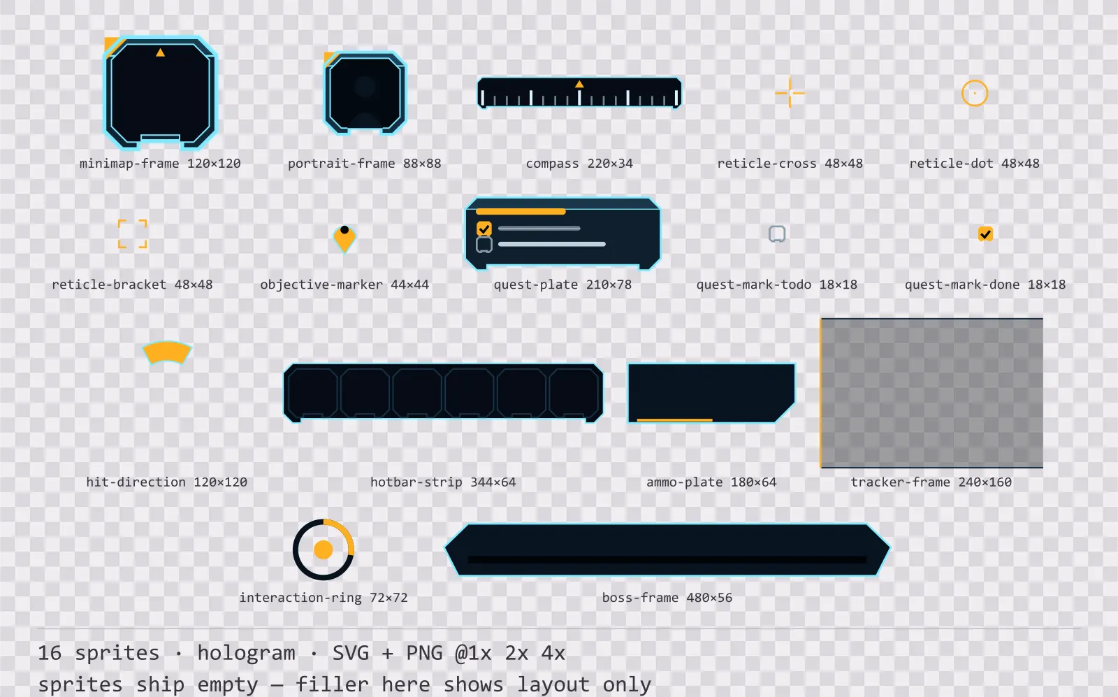
Hologrid HUD Frames
16 hologram heads-up display frames for dark interfaces — abyss navy with signal amber accents. SVG plus transparent PNG at 1x, 2x and 4x.
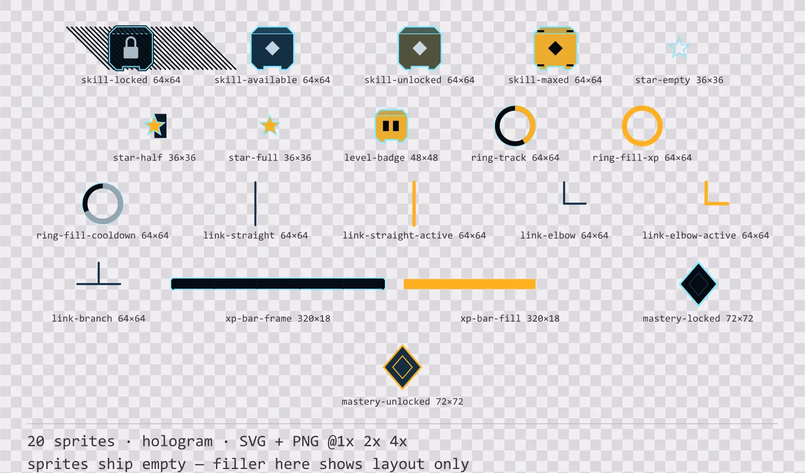
Hologrid Progression Kit
20 hologram progression and reward components for dark interfaces — abyss navy with signal amber accents. SVG plus transparent PNG at 1x, 2x and 4x.
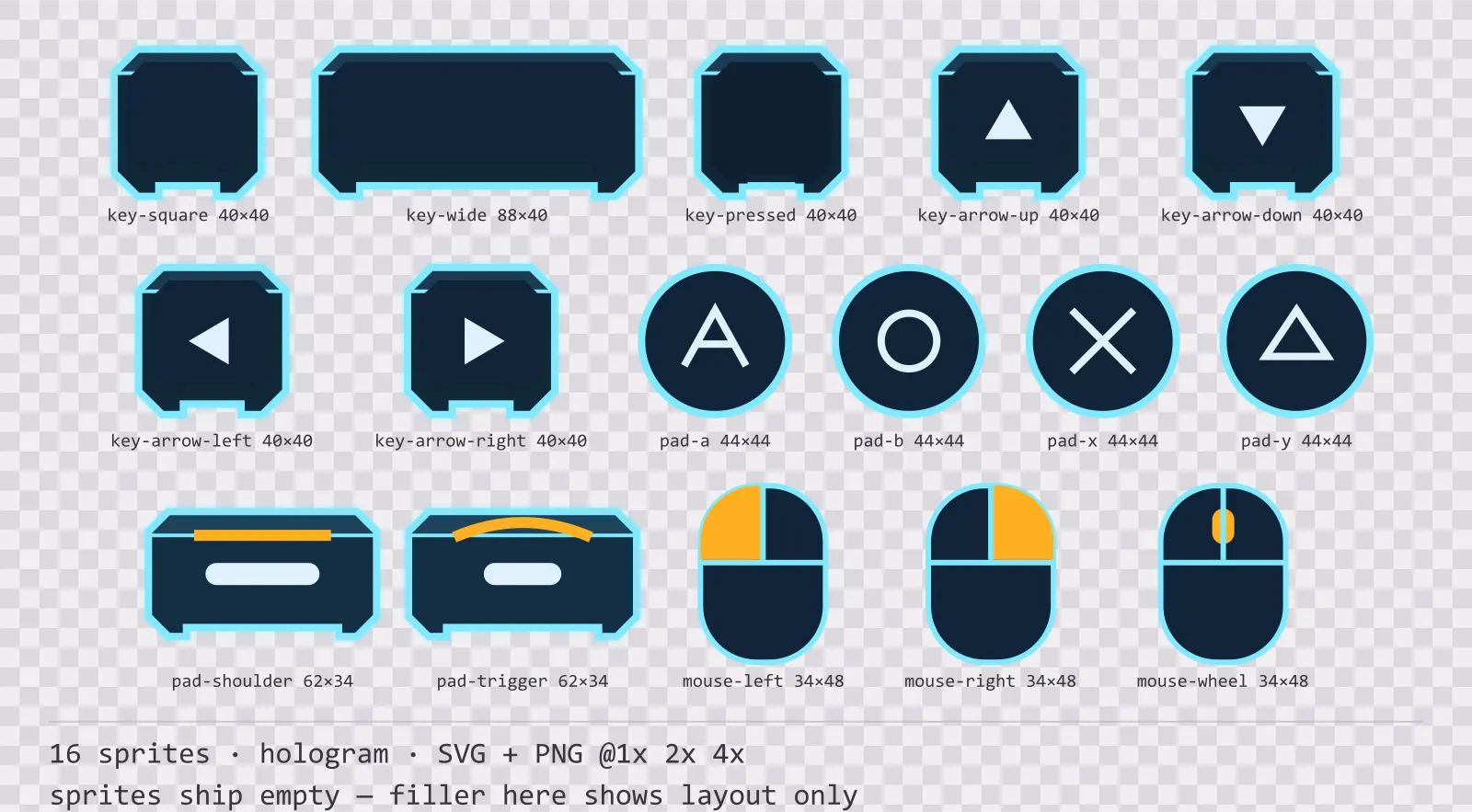
Hologrid Input Prompts
16 hologram input prompt sprites for dark interfaces — abyss navy with signal amber accents. SVG plus transparent PNG at 1x, 2x and 4x.
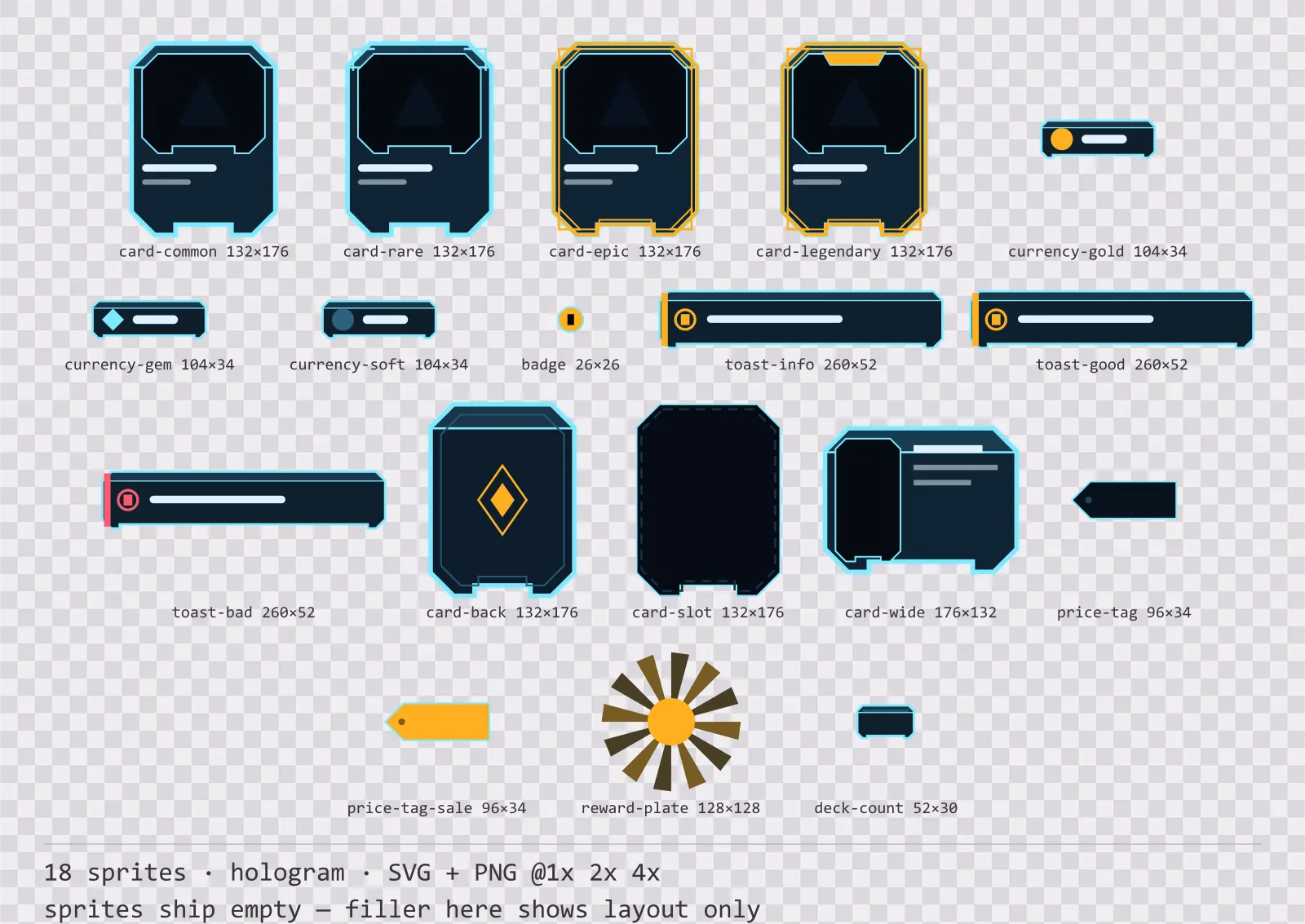
Hologrid Card Frames
18 hologram card, currency and notification components for dark interfaces — abyss navy with signal amber accents. SVG plus transparent PNG at 1x, 2x and 4x.
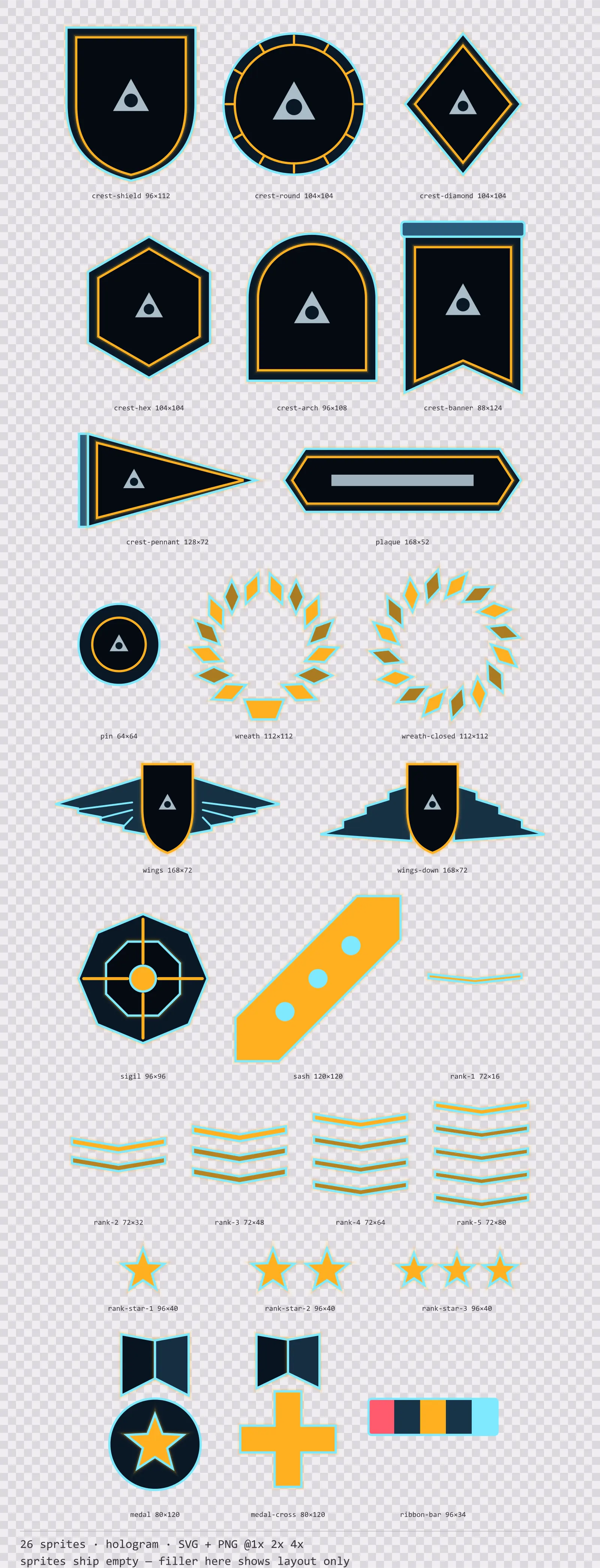
Hologrid Emblems
26 hologram crests, insignia and rank marks for dark interfaces — abyss navy with signal amber accents. SVG plus transparent PNG at 1x, 2x and 4x.
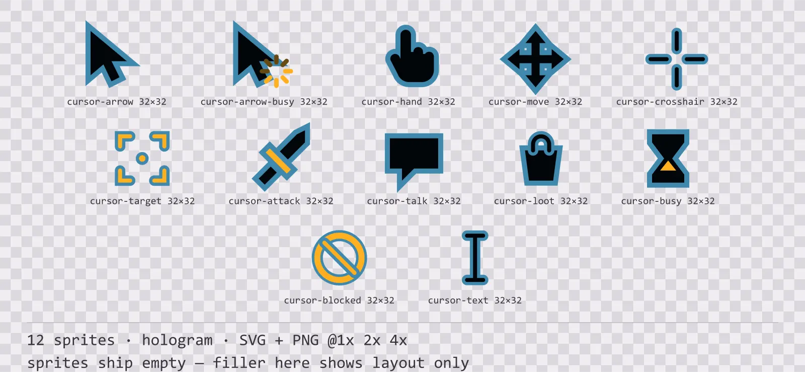
Hologrid Cursors
12 hologram mouse cursors for dark interfaces — abyss navy with signal amber accents. SVG plus transparent PNG at 1x, 2x and 4x.
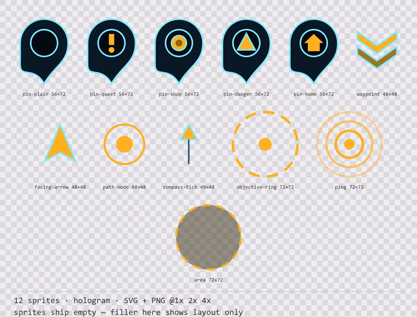
Hologrid Map Markers
12 hologram map markers and world indicators for dark interfaces — abyss navy with signal amber accents. SVG plus transparent PNG at 1x, 2x and 4x.
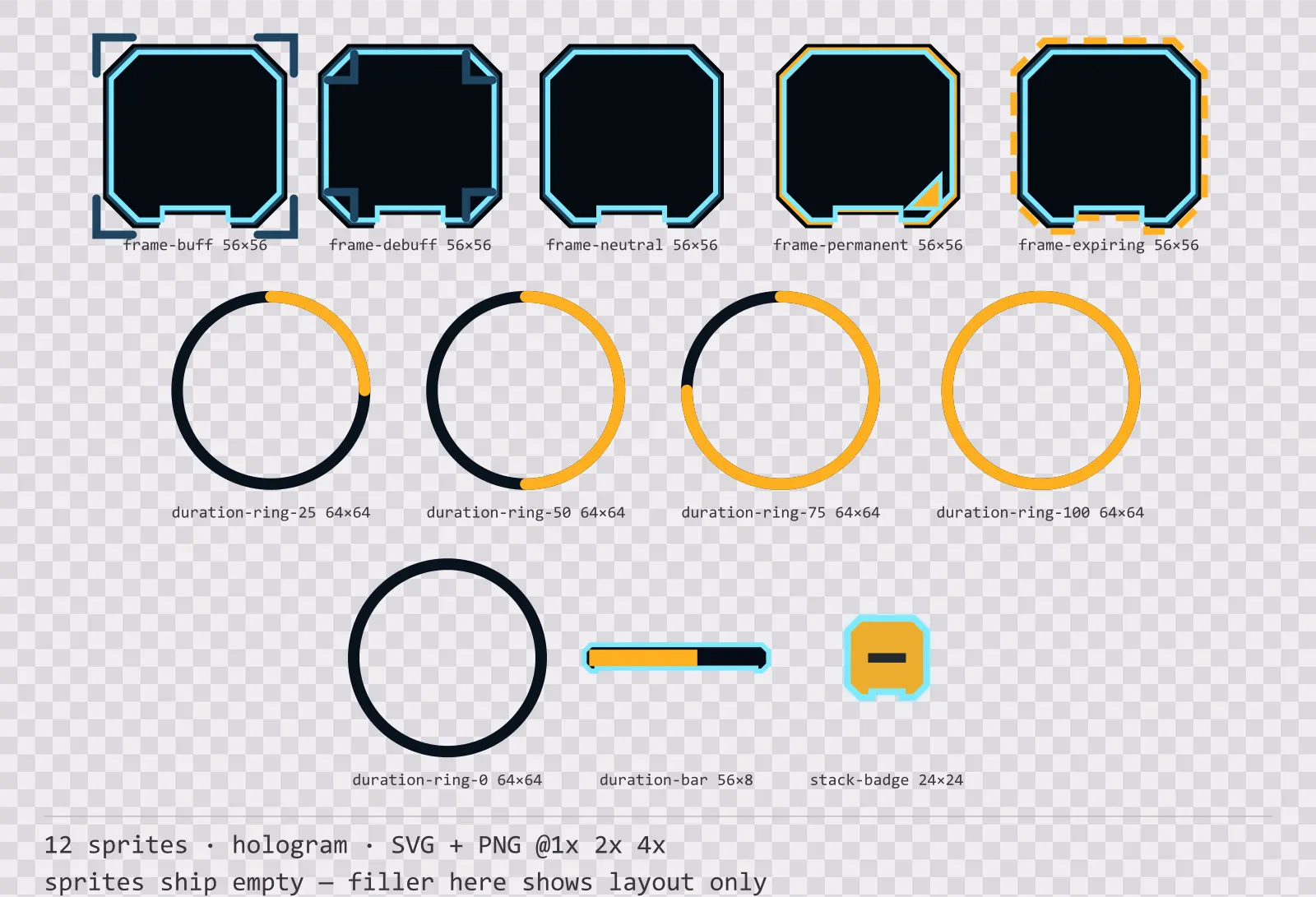
Hologrid Status Effects
12 hologram status effect frames and duration indicators for dark interfaces — abyss navy with signal amber accents. SVG plus transparent PNG at 1x, 2x and 4x.
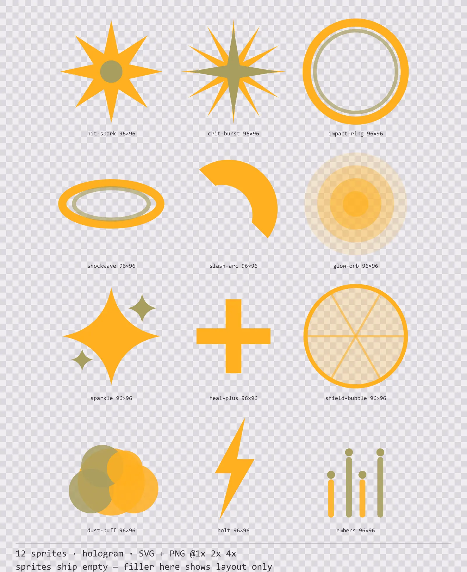
Hologrid Hit Effects
12 hologram impact and effect sprites for dark interfaces — abyss navy with signal amber accents. SVG plus transparent PNG at 1x, 2x and 4x.
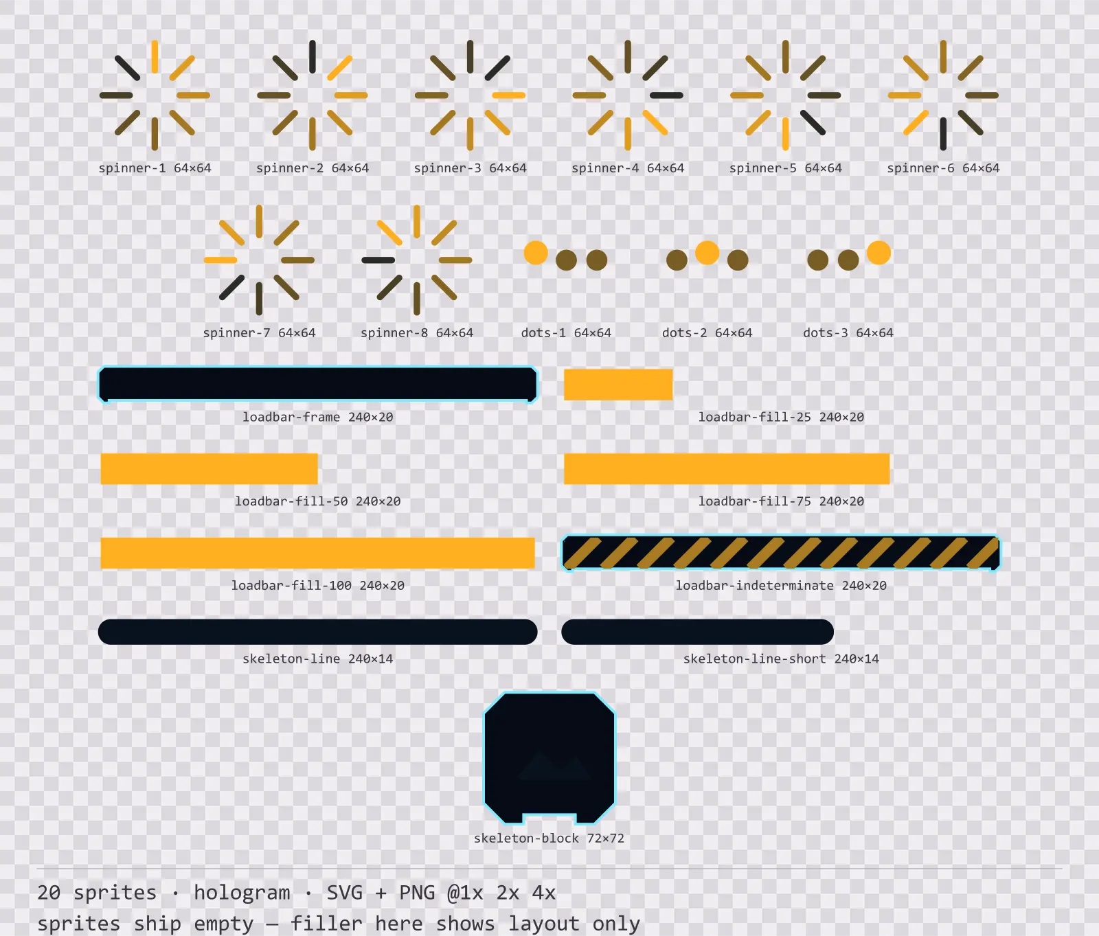
Hologrid Loading
20 hologram loading and waiting indicators for dark interfaces — abyss navy with signal amber accents. SVG plus transparent PNG at 1x, 2x and 4x.
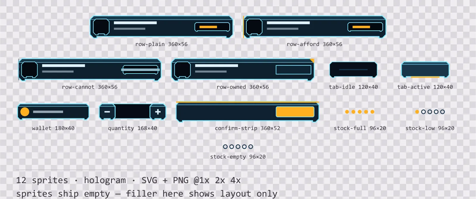
Hologrid Shop UI
12 hologram shop and economy widgets for dark interfaces — abyss navy with signal amber accents. SVG plus transparent PNG at 1x, 2x and 4x.
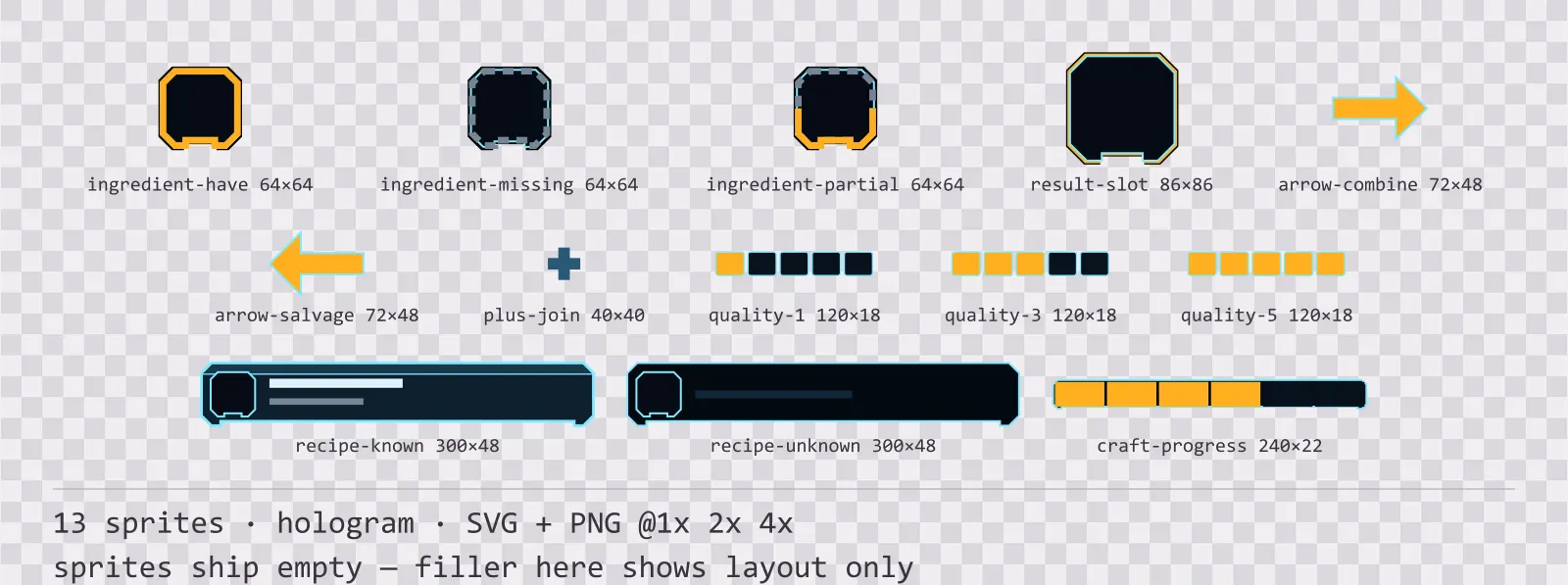
Hologrid Crafting UI
13 hologram crafting and recipe widgets for dark interfaces — abyss navy with signal amber accents. SVG plus transparent PNG at 1x, 2x and 4x.
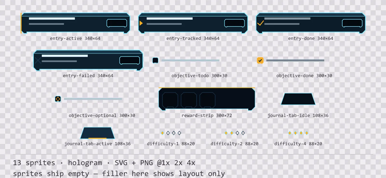
Hologrid Quest Log
13 hologram quest log and objective widgets for dark interfaces — abyss navy with signal amber accents. SVG plus transparent PNG at 1x, 2x and 4x.
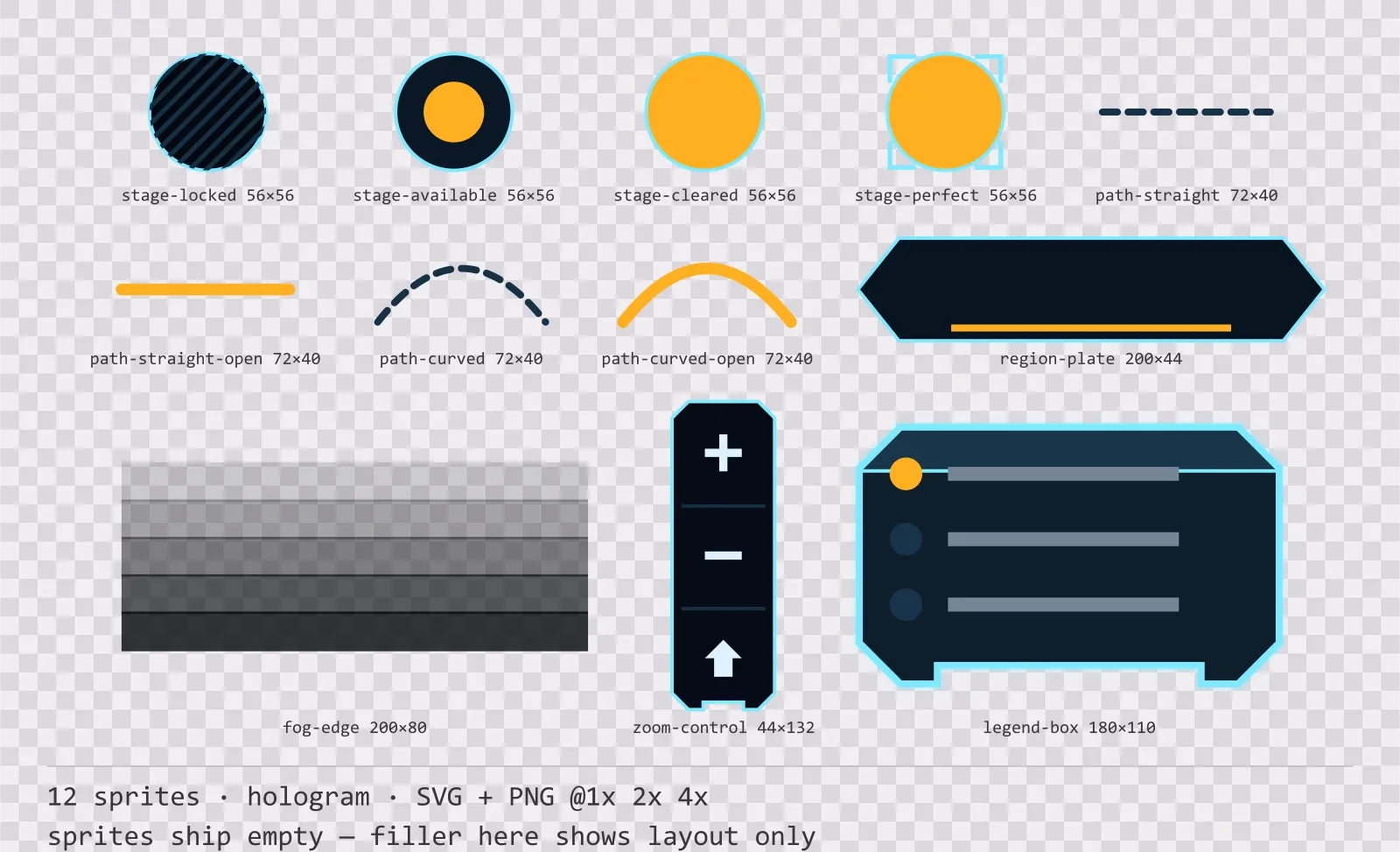
Hologrid Level Select
12 hologram level select and world map pieces for dark interfaces — abyss navy with signal amber accents. SVG plus transparent PNG at 1x, 2x and 4x.
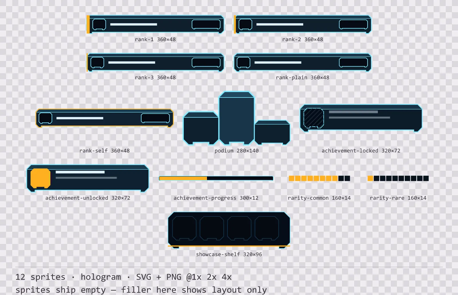
Hologrid Leaderboard
12 hologram leaderboard and achievement widgets for dark interfaces — abyss navy with signal amber accents. SVG plus transparent PNG at 1x, 2x and 4x.
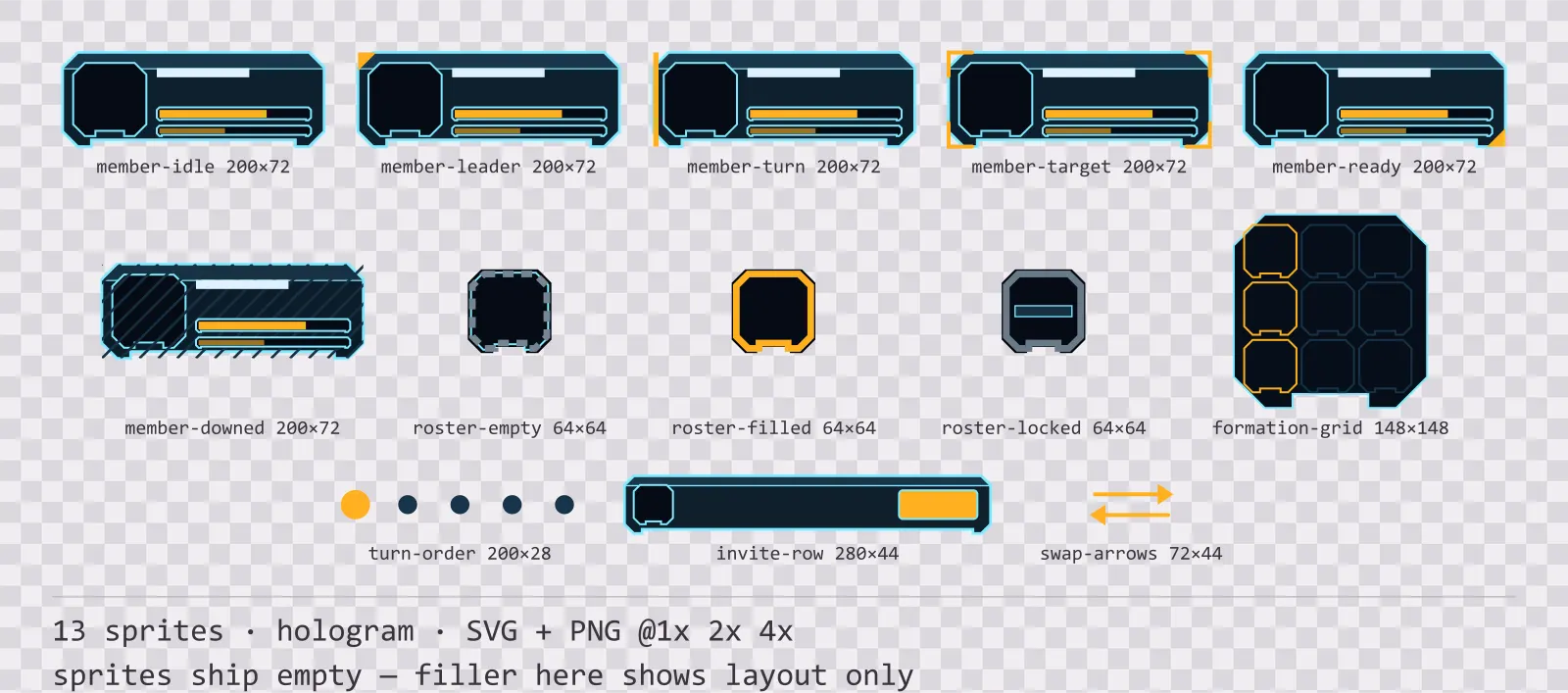
Hologrid Party UI
13 hologram party and roster widgets for dark interfaces — abyss navy with signal amber accents. SVG plus transparent PNG at 1x, 2x and 4x.
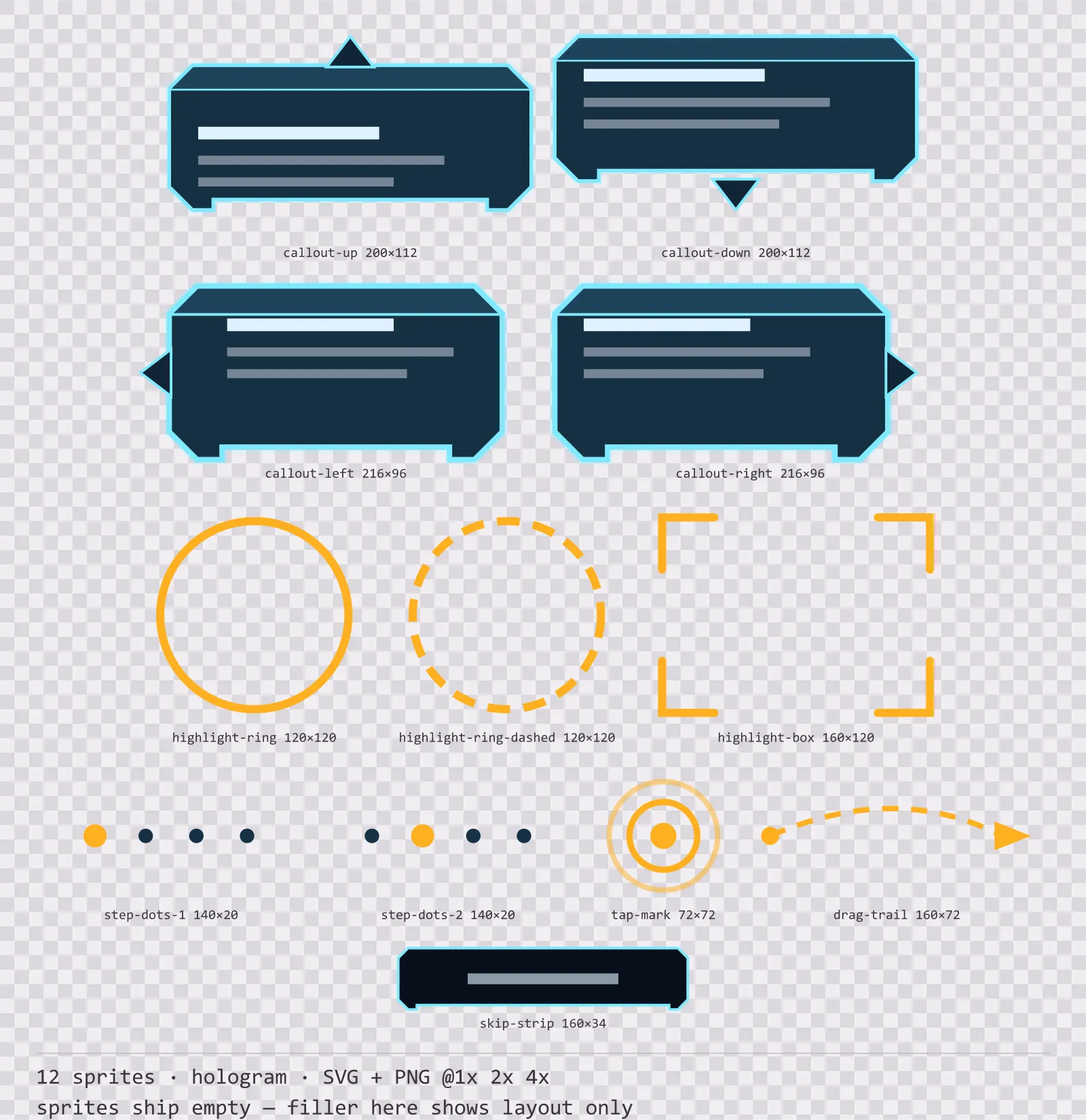
Hologrid Tutorial UI
12 hologram tutorial and onboarding markers for dark interfaces — abyss navy with signal amber accents. SVG plus transparent PNG at 1x, 2x and 4x.
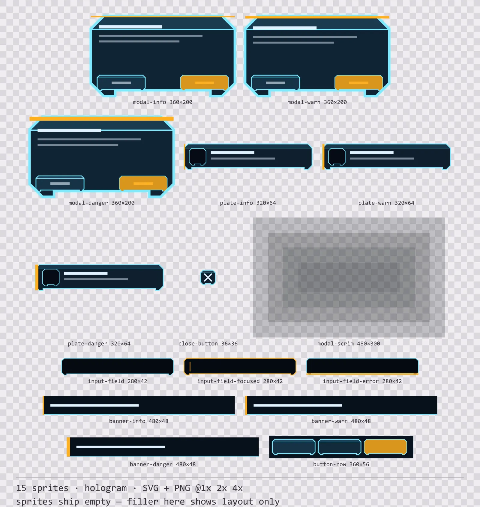
Hologrid Modals
15 hologram modal dialogs and system notices for dark interfaces — abyss navy with signal amber accents. SVG plus transparent PNG at 1x, 2x and 4x.
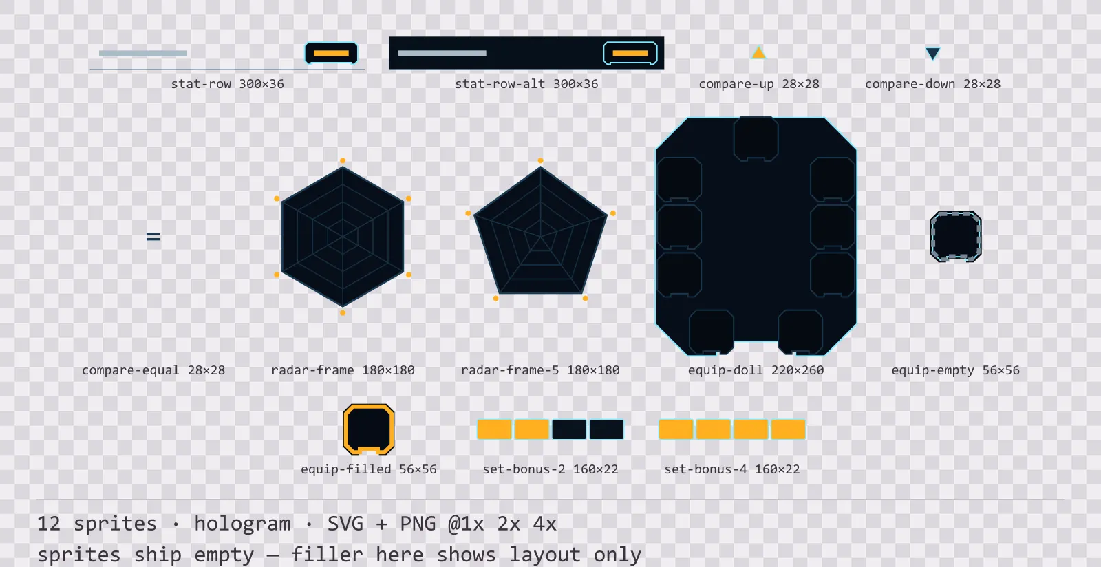
Hologrid Character Sheet
12 hologram character sheet and stat widgets for dark interfaces — abyss navy with signal amber accents. SVG plus transparent PNG at 1x, 2x and 4x.
Each asset is downloaded from its own page — that way you only take what you need, and the file list, sizes and license stay accurate per item.