UI Packs
Hologrid Progression Kit
20 hologram progression and reward components for dark interfaces — abyss navy with signal amber accents. SVG plus transparent PNG at 1x, 2x and 4x.
About this pack
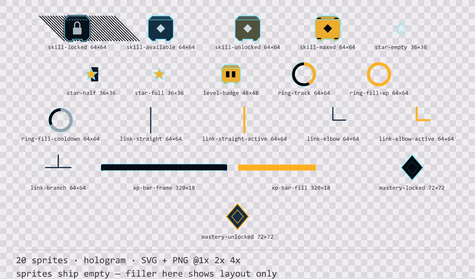
Hologrid Progression Kit is a set of 20 progression and reward components drawn in the hologram style, where a thin trace carries a wide halo, and most of the frame is empty space. It contains four skill tree node states, straight, elbow and branch tree links in two states, a locked and an unlocked mastery node, empty, half and full rating stars, a level badge, an experience bar with tier ticks, an experience ring and an ability cooldown ring.
Progression screens are where state matters most and where colour is least reliable: a skill tree is already covered in ability art in every hue, so a node whose state is only a border colour is unreadable the moment it has an icon in it.
The halo is a stack of strokes at falling opacity rather than a blur filter — a filter is applied differently by some SVG rasterisers and smears at 4x. The trace is deliberately thin: a projected interface reads as light, and a heavy line reads as paint.
Inside that style this is the Hologrid reading of it: a dark interface on a abyss navy palette with signal amber accents, built around a single bordered frame, square-cornered buttons at 132x38, tick-marked bars divided into 20 segments, and outlined icons on a 24px grid. Those measurements are why two families can share an art style without being interchangeable: the style decides how an edge is drawn, the numbers decide what the interface is for.
The tree links are the part that was missing for longest: a skill tree is not made of nodes but of the relationship between them, and without a connector drawn in the same style the developer ends up drawing their own line that does not match. Straight, elbow and branch cover a grid layout, and each comes dim and active — the active path is not just accent-coloured but thicker, because a skill screen is already full of coloured icons. The locked node is hatched, the maxed node carries four corner ticks, and the available node is simply the plain face — three states told by texture and count rather than by hue. The two rings share one geometry and differ only in fill direction and colour, so they line up when stacked.
Every sprite ships as an editable SVG and as transparent PNG at 1x, 2x and 4x, so you can drop the PNGs straight into an engine or open the vector and change a colour. Built to the same measurements as the rest of the Hologrid family, which means this kit and the Hologrid panel kit line up without either being resized. A good fit for sci-fi projections, scanners and near-future overlays.
Download
Direct link · no sign-up · no wait pageComplete set — SVG sources, PNG exports at 1x/2x/4x, licence and readme

How to use it
- Draw the ability icon inside the skill node, not over it; the node art leaves the centre clear for exactly that.
- Animate the cooldown ring by redrawing the arc rather than by rotating the sprite — the supplied frame is a static example at 68%.
- Stack three stars at the same size for a rating row; the half star exists so a 2.5 average does not have to round.
License
Creative Commons Attribution 4.0 — Free for commercial use. Credit required. Full terms · What this means in practice
"Hologrid Progression Kit" by Oğuzhan Girgin, licensed under CC BY 4.0 — https://www.colorosse.com/assets/2d/ui/hologrid-progression-kitAlso browse
More UI Packs
See all →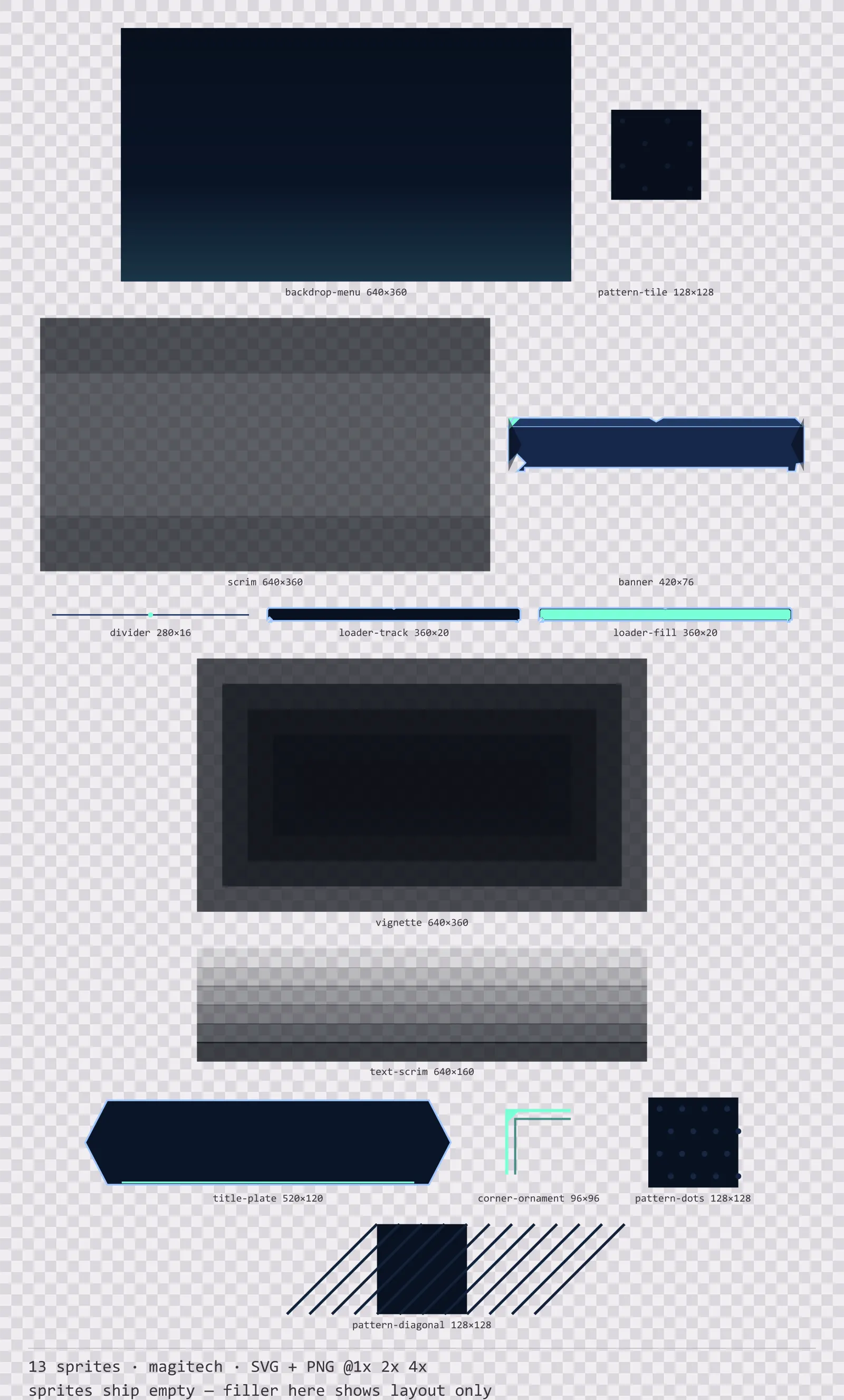
Aetherlab Backdrops
13 magitech background and overlay pieces for dark interfaces — lab navy with aether cyan accents. SVG plus transparent PNG at 1x, 2x and 4x.
Aetherlab Card Frames
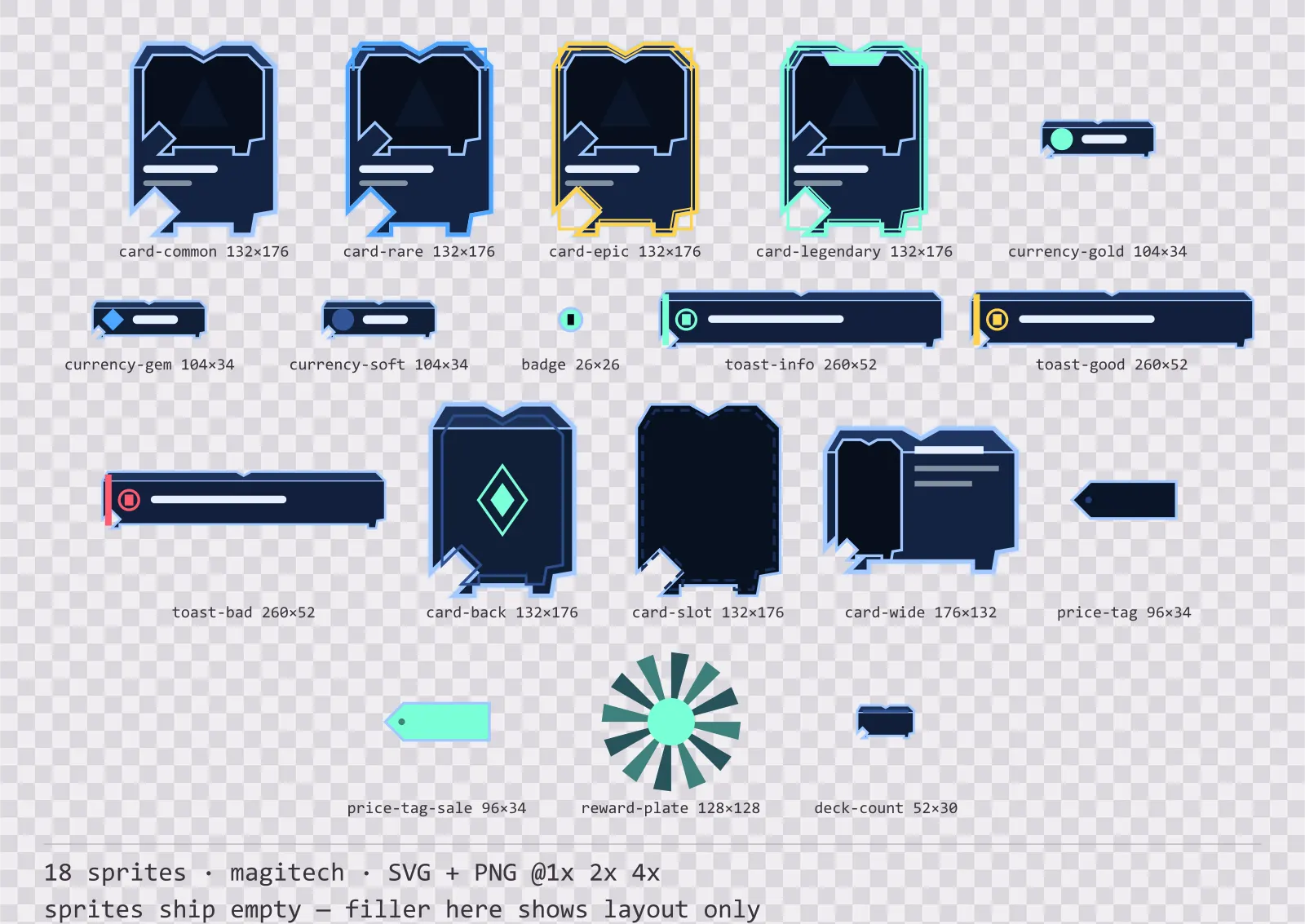
18 magitech card, currency and notification components for dark interfaces — lab navy with aether cyan accents. SVG plus transparent PNG at 1x, 2x and 4x.
Aetherlab Character Sheet
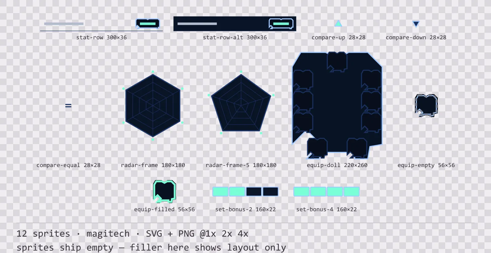
12 magitech character sheet and stat widgets for dark interfaces — lab navy with aether cyan accents. SVG plus transparent PNG at 1x, 2x and 4x.
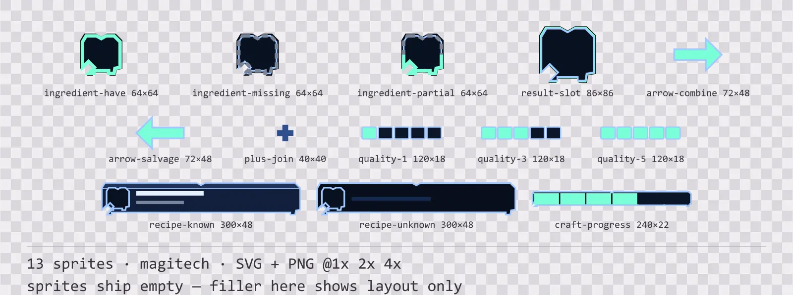
Aetherlab Crafting UI
13 magitech crafting and recipe widgets for dark interfaces — lab navy with aether cyan accents. SVG plus transparent PNG at 1x, 2x and 4x.