UI Packs
Charcoal Status Effects
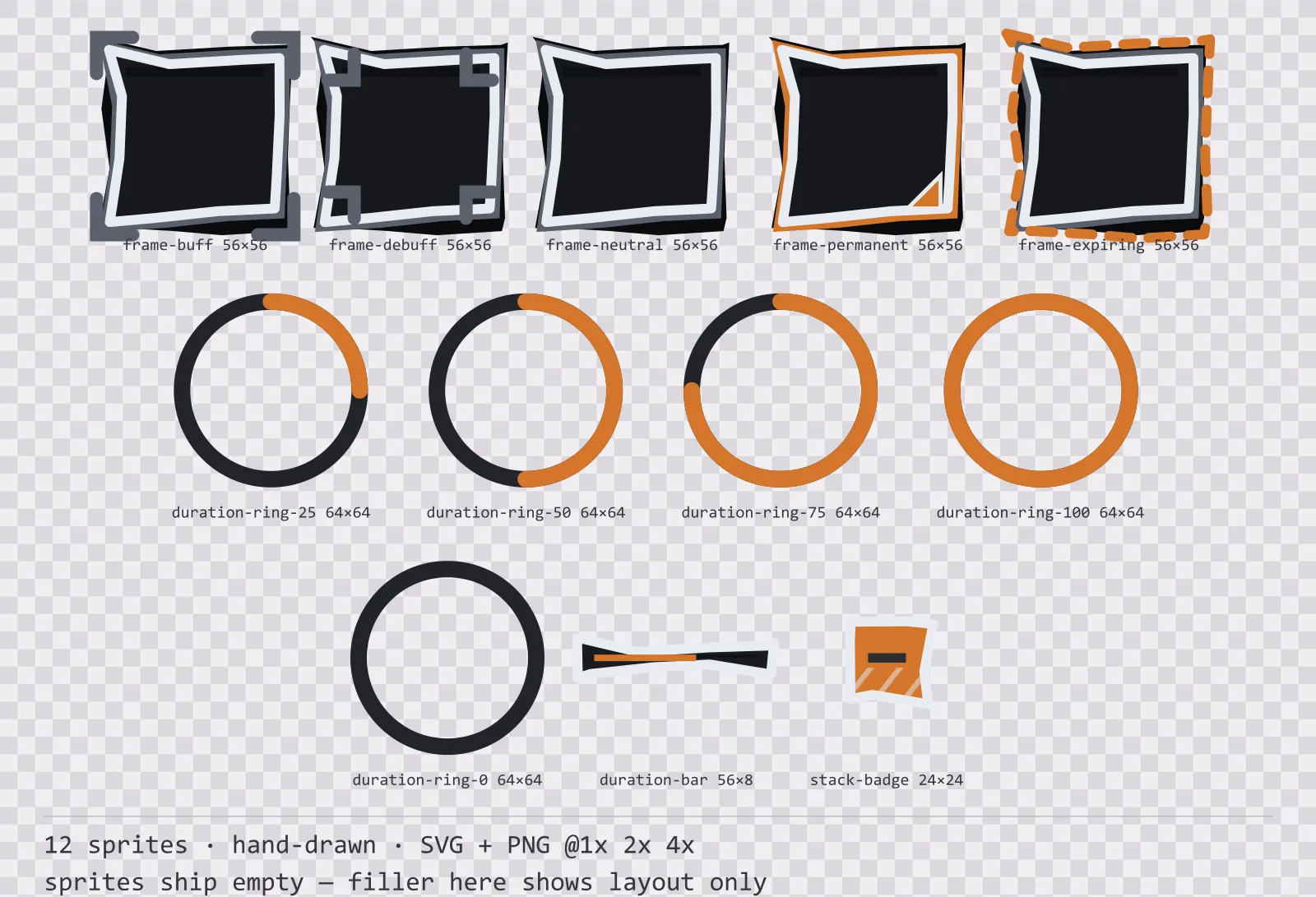
12 hand-drawn status effect frames and duration indicators for dark interfaces — smoke grey with ember orange accents. SVG plus transparent PNG at 1x, 2x and 4x.
About this pack
Charcoal Status Effects is a set of 12 status effect frames and duration indicators drawn in the hand-drawn style, where every edge is sampled and nudged, so no line is truly straight. It contains buff, debuff and neutral frames, permanent and expiring frames, five duration ring steps, a duration bar and a stack count badge.
A buff icon sits on screen for three seconds and the player never looks straight at it — they catch it in the corner of their eye. That rules out the usual solution: a green border for good and a red one for bad collapses in colourblind modes, and it collides with whatever colours the game itself is already using on that HUD.
The wobble is deterministic rather than random: the same box wobbles the same way every build, which is what lets it live in version control. Shading is cross-hatching, because a gradient under a drawn line reads as a filter rather than as a hand.
Inside that style this is the Charcoal reading of it: a dark interface on a smoke grey palette with ember orange accents, built around a single bordered frame, tab-shaped buttons at 160x52, hollow-cored bars divided into 7 segments, and two-tone icons on a 24px grid. Those measurements are why two families can share an art style without being interchangeable: the style decides how an edge is drawn, the numbers decide what the interface is for.
Buff and debuff are separated by shape instead. The buff frame pushes its corners outward and the debuff frame folds them inward: one grows, the other eats. Both survive a greyscale screenshot. Duration is a ring around the icon rather than a bar beneath it, because a bar pushes every icon down a few pixels and breaks the row. The rings ship as five steps rather than one sprite because most engines cannot clip an SVG at runtime — a filling ring is either a shader or a step atlas, and the atlas works everywhere. The frames ship empty: your own effect icon goes in the middle.
Every sprite ships as an editable SVG and as transparent PNG at 1x, 2x and 4x, so you can drop the PNGs straight into an engine or open the vector and change a colour. Built to the same measurements as the rest of the Charcoal family, which means this kit and the Charcoal panel kit line up without either being resized. A good fit for notebook and storybook games.
Download
Direct link · no sign-up · no wait pageComplete set — SVG sources, PNG exports at 1x/2x/4x, licence and readme

How to use it
- Put your effect icon in the recessed centre at about 60% of the frame width; the recess is drawn with that margin.
- Swap the whole frame between buff and debuff rather than tinting one, because the difference is in the corners.
- Play the duration rings as an ordered sequence from full to empty, or use the ring at 50 percent as the single frame when the exact remainder does not matter.
- Anchor the stack badge to the top-right corner of the frame and draw the count with your own font — no digits are drawn here.
License
Creative Commons Attribution 4.0 — Free for commercial use. Credit required. Full terms · What this means in practice
"Charcoal Status Effects" by Oğuzhan Girgin, licensed under CC BY 4.0 — https://www.colorosse.com/assets/2d/ui/charcoal-status-effectsMore UI Packs
See all →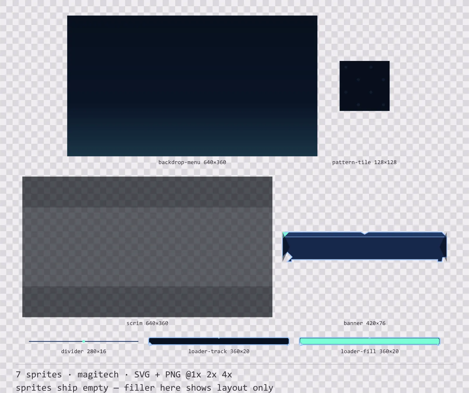
Aetherlab Backdrops
13 magitech background and overlay pieces for dark interfaces — lab navy with aether cyan accents. SVG plus transparent PNG at 1x, 2x and 4x.
Aetherlab Card Frames
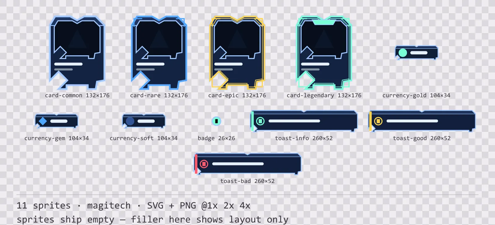
18 magitech card, currency and notification components for dark interfaces — lab navy with aether cyan accents. SVG plus transparent PNG at 1x, 2x and 4x.
Aetherlab Character Sheet
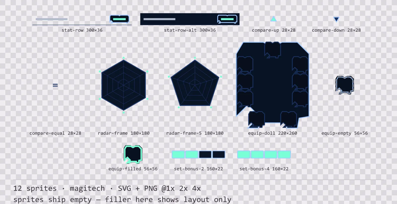
12 magitech character sheet and stat widgets for dark interfaces — lab navy with aether cyan accents. SVG plus transparent PNG at 1x, 2x and 4x.
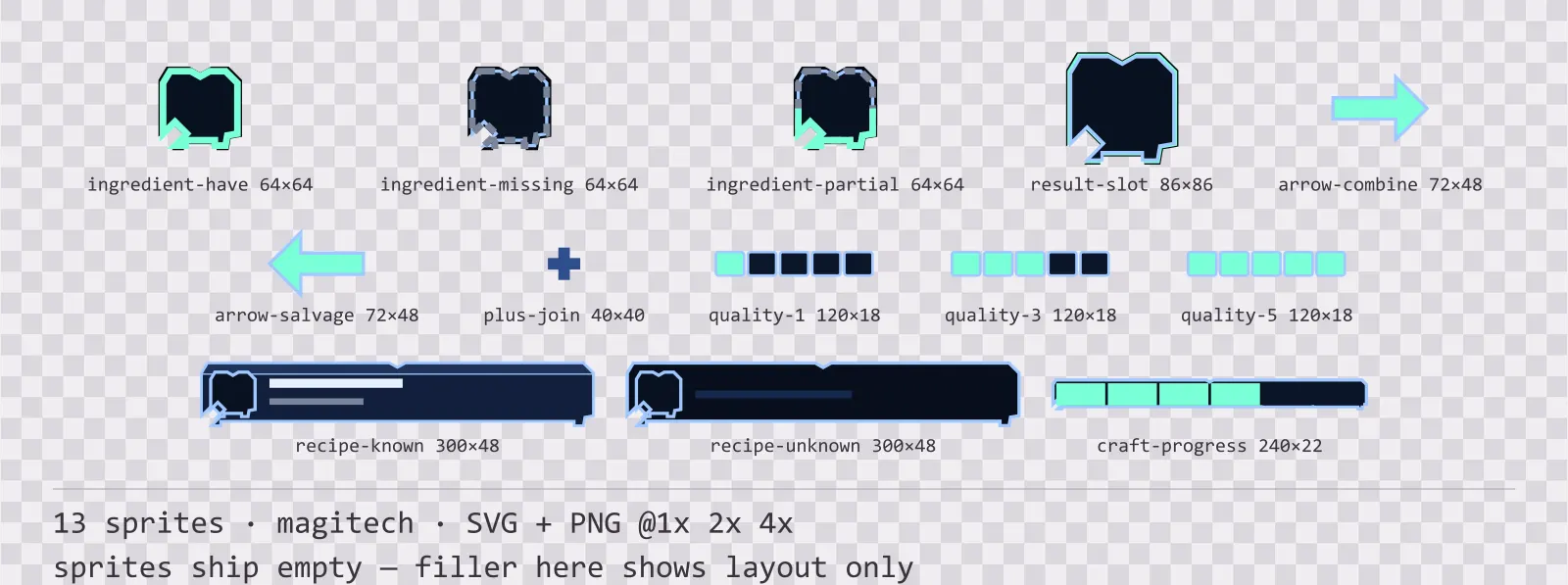
Aetherlab Crafting UI
13 magitech crafting and recipe widgets for dark interfaces — lab navy with aether cyan accents. SVG plus transparent PNG at 1x, 2x and 4x.