UI Packs
Bitrush Modals
15 Y2K modal dialogs and system notices for dark interfaces — ink black with signal yellow accents. SVG plus transparent PNG at 1x, 2x and 4x.
About this pack
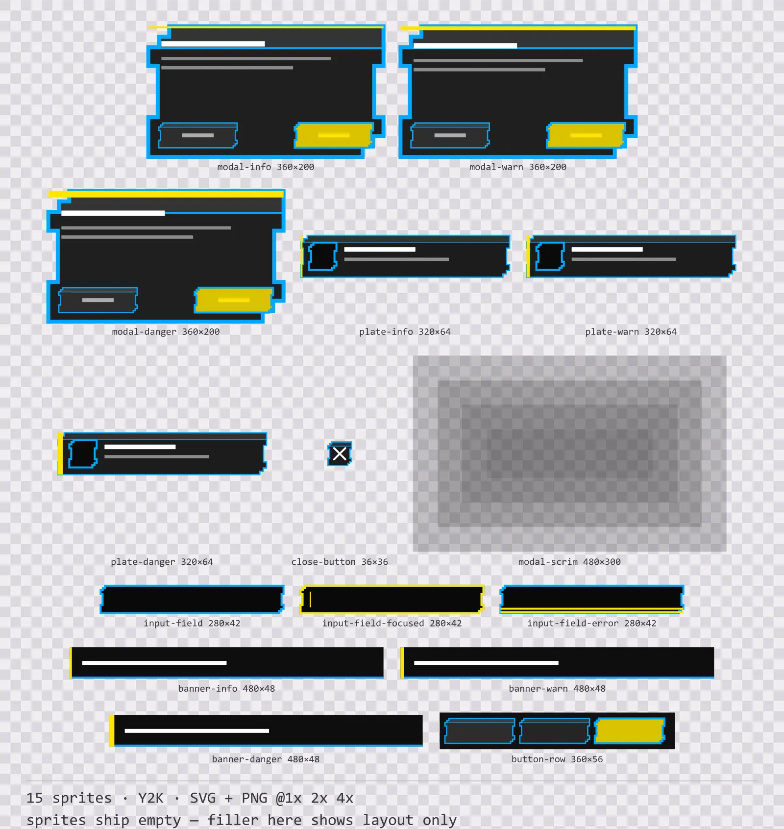
Bitrush Modals is a set of 15 modal dialogs and system notices drawn in the Y2K style, where everything is flat and printed — thick straight outlines, solid blocks, no glow anywhere. It contains three modal dialogs at rising severity, three system plates and three system banners, a three-button footer row, a close button, a layered backdrop scrim and a plain, a focused and an error input field.
A modal is not a panel: it stops the game, waits for an answer, and sometimes the answer cannot be undone. The usual way to say that is a red border, which collides with the health colour already on screen and disappears the moment a developer retints the kit to their own palette.
No gradient and no halo: the whole set is flat colour with a heavy straight outline, which is what separates the Y2K poster look from the neon one. The silhouettes are composed corner by corner rather than scaled from one rectangle, so a badge and a banner in the same set do not share an outline.
Inside that style this is the Bitrush reading of it: a dark interface on a ink black palette with signal yellow accents, built around a header band across the top of the frame, tab-shaped buttons at 148x52, banded bars divided into 8 segments, and solid icons on a 16px grid. Those measurements are why two families can share an art style without being interchangeable: the style decides how an edge is drawn, the numbers decide what the interface is for.
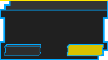
Severity is carried by the thickness of the strip along the top edge rather than by its hue, three pixels for a notice, six for a warning and ten for something destructive, so it survives any tint and any greyscale screenshot. The button positions are fixed and deliberate: cancel sits left and raised, the committing action sits right and recessed. That ordering becomes muscle memory across a game, and a kit that varies it is how a player deletes a save by reflex. The scrim is four stacked steps rather than one even wash, because a single black sheet over the whole screen kills the art it is dimming.
Every sprite ships as an editable SVG and as transparent PNG at 1x, 2x and 4x, so you can drop the PNGs straight into an engine or open the vector and change a colour. Built to the same measurements as the rest of the Bitrush family, which means this kit and the Bitrush panel kit line up without either being resized. A good fit for retro-futuristic menus and poster-styled interfaces.
Download
Direct link · no sign-up · no wait pageComplete set — SVG sources, PNG exports at 1x/2x/4x, licence and readme
How to use it
- Keep cancel on the left and the committing action on the right in every dialog, including the ones you build yourself from the footer row.
- Pick the modal by the weight of its top strip rather than retinting one sprite. The thickness is the signal.
- Lay the scrim behind the modal at the size of your screen and tile it: it is drawn as discrete steps so it scales without a blur artefact.
- Use the error input field rather than a red border. It doubles the underline, which reads in greyscale and next to a health bar.
License
Creative Commons Zero 1.0 — Public domain. No credit required. Full terms · What this means in practice
More UI Packs
See all →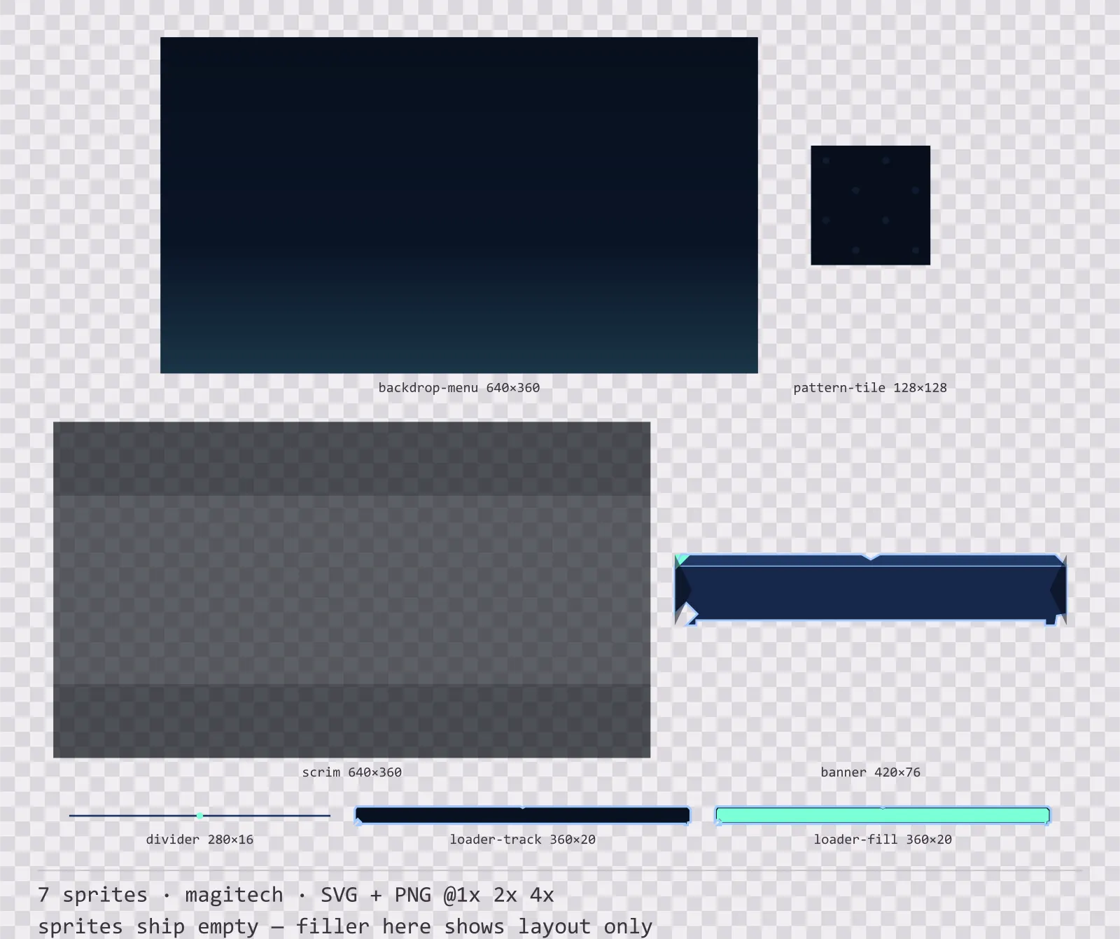
Aetherlab Backdrops
13 magitech background and overlay pieces for dark interfaces — lab navy with aether cyan accents. SVG plus transparent PNG at 1x, 2x and 4x.
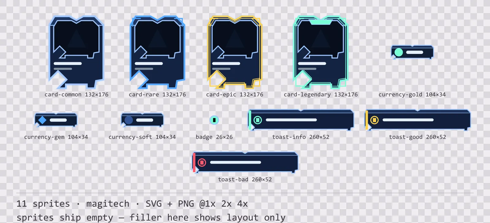
Aetherlab Card Frames
18 magitech card, currency and notification components for dark interfaces — lab navy with aether cyan accents. SVG plus transparent PNG at 1x, 2x and 4x.
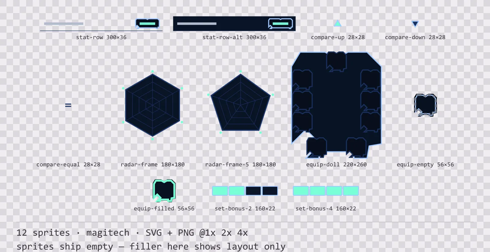
Aetherlab Character Sheet
12 magitech character sheet and stat widgets for dark interfaces — lab navy with aether cyan accents. SVG plus transparent PNG at 1x, 2x and 4x.
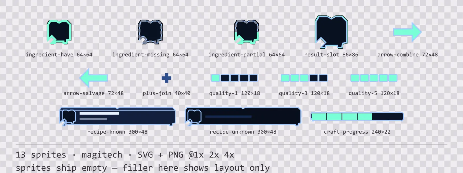
Aetherlab Crafting UI
13 magitech crafting and recipe widgets for dark interfaces — lab navy with aether cyan accents. SVG plus transparent PNG at 1x, 2x and 4x.