UI Packs
Oak Card Frames
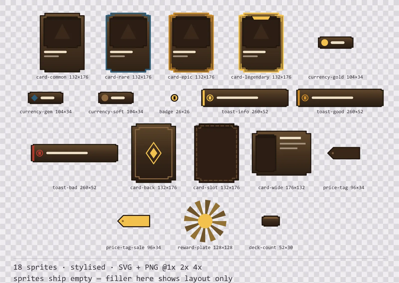
18 stylised card, currency and notification components for dark interfaces — wood-brown with polished brass accents. SVG plus transparent PNG at 1x, 2x and 4x.
About this pack
Oak Card Frames is a set of 18 card, currency and notification components drawn in the stylised style, where the frame is carved, with finials pushing out past the corners and a gem set into each one. It contains four rarity card frames, a card back and an empty card slot, a landscape card frame, three currency counters, a plain and a sale price tag, a reward burst plate and a deck count plate, a notification badge and three toast banners.
Rarity is almost always encoded as a border colour, which fails twice: it disappears in greyscale, and it competes with the item art, which is itself coloured. This set encodes rarity as structure instead.
The ornament is part of the silhouette rather than drawn on top of it, so the frame is recognisable at thumbnail size. The face carries a three-stop vertical gradient — the closest a flat kit gets to a painted bevel.
Inside that style this is the Oak reading of it: a dark interface on a wood-brown palette with polished brass accents, built around two concentric frames, tab-shaped buttons at 160x48, glossy bars divided into 8 segments, and solid icons on a 32px grid. Those measurements are why two families can share an art style without being interchangeable: the style decides how an edge is drawn, the numbers decide what the interface is for.
The card back carries no rarity mark at all, and that is deliberate: whether a face-down card reveals its rarity is a rule your game makes, not one this kit should assume. The landscape frame is a separate file rather than the portrait one rotated, because rotating it would move the corner brackets onto the wrong edges. Each tier adds a countable feature — common has none, rare adds two corner brackets, epic adds an inner rule and four brackets, legendary adds a crown band. You can tell them apart at thumbnail size, in a screenshot, and with the colour removed. The toast banners keep colour to a 6px edge stripe so the message text sits at the same contrast in all three tones.
Every sprite ships as an editable SVG and as transparent PNG at 1x, 2x and 4x, so you can drop the PNGs straight into an engine or open the vector and change a colour. Built to the same measurements as the rest of the Oak family, which means this kit and the Oak panel kit line up without either being resized. A good fit for fantasy and RPG interfaces.
Download
Direct link · no sign-up · no wait pageComplete set — SVG sources, PNG exports at 1x/2x/4x, licence and readme
How to use it
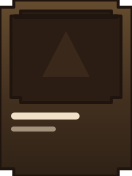
- Nine-slice the card frames on their flat edges only; the corner brackets and the crown band must stay in the fixed corners or the rarity signal stretches.
- Put the item icon in the recessed art area and the name on the two label bars below it — the frame is sized for a 1:1 icon.
- Use the badge as an overlay anchored to the top-right of an inventory or menu button, and draw the count with your own font.
License
Creative Commons Attribution 4.0 — Free for commercial use. Credit required. Full terms · What this means in practice
"Oak Card Frames" by Oğuzhan Girgin, licensed under CC BY 4.0 — https://www.colorosse.com/assets/2d/ui/oak-card-framesAlso browse
More UI Packs
See all →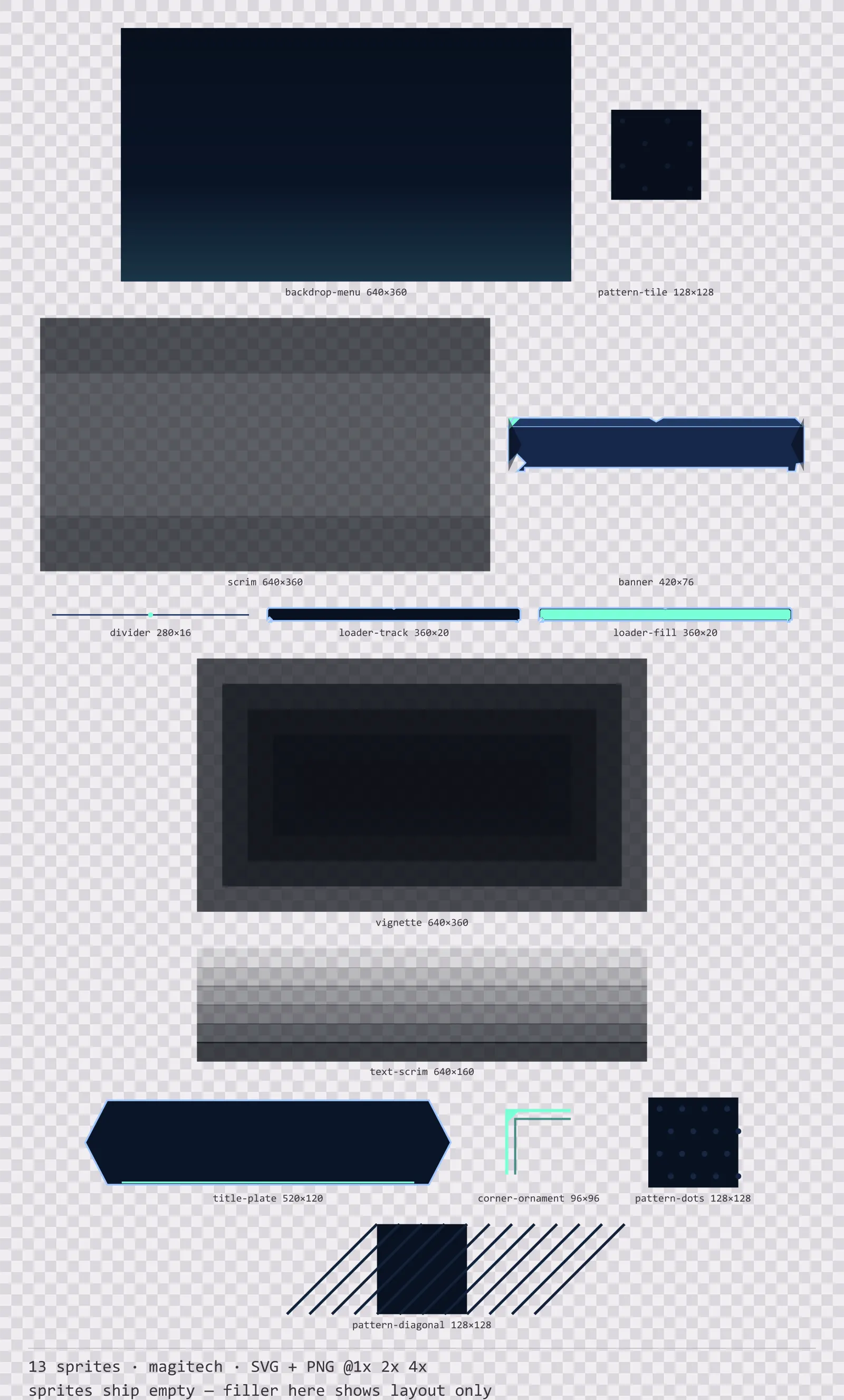
Aetherlab Backdrops
13 magitech background and overlay pieces for dark interfaces — lab navy with aether cyan accents. SVG plus transparent PNG at 1x, 2x and 4x.
Aetherlab Card Frames
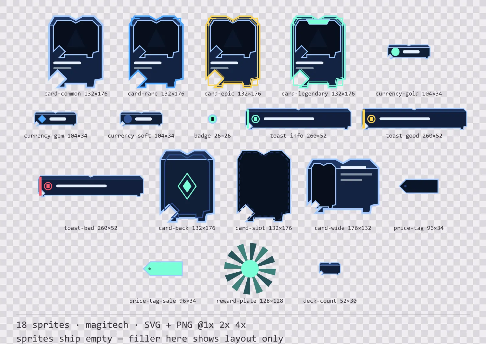
18 magitech card, currency and notification components for dark interfaces — lab navy with aether cyan accents. SVG plus transparent PNG at 1x, 2x and 4x.
Aetherlab Character Sheet
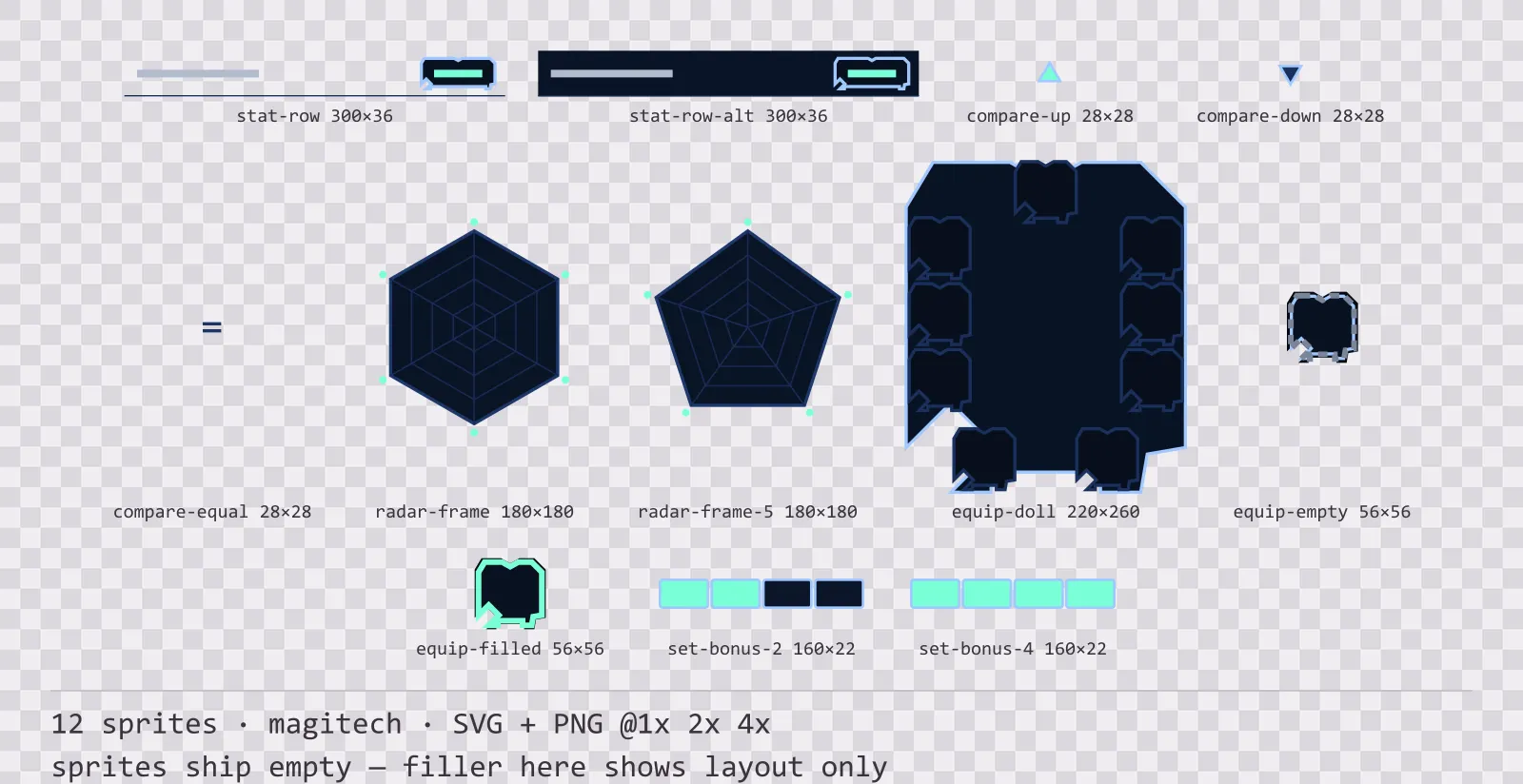
12 magitech character sheet and stat widgets for dark interfaces — lab navy with aether cyan accents. SVG plus transparent PNG at 1x, 2x and 4x.
Aetherlab Crafting UI
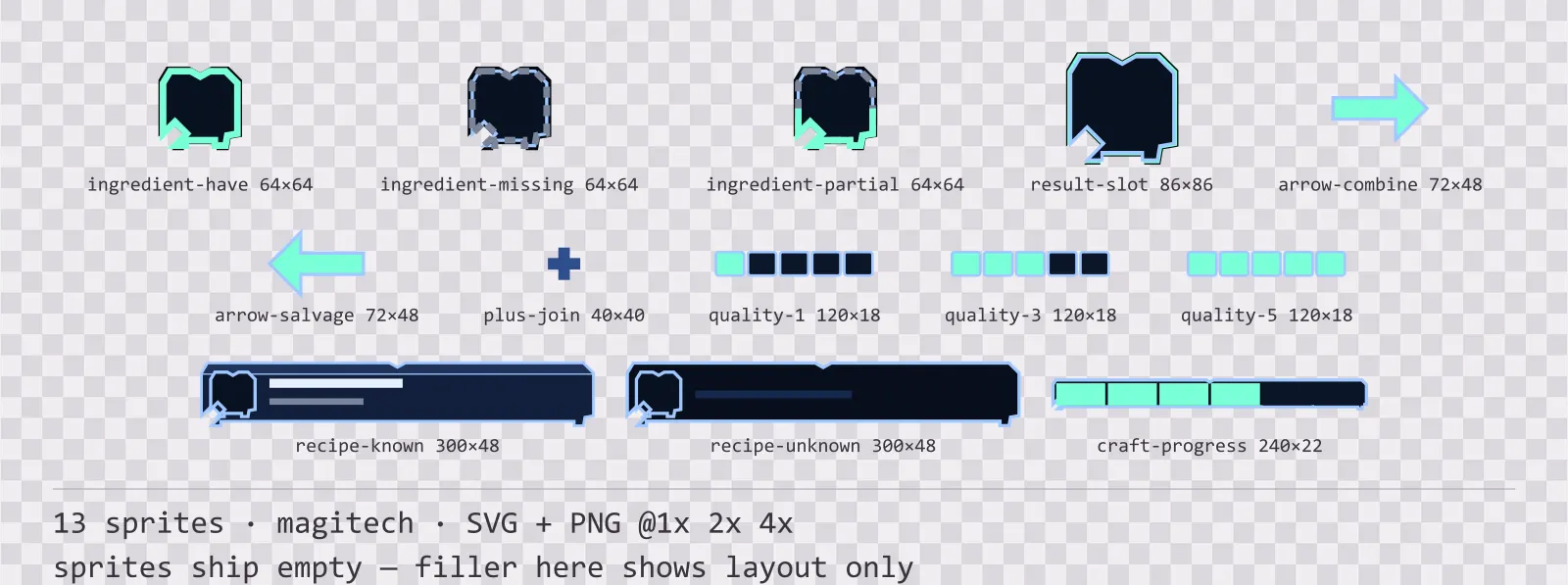
13 magitech crafting and recipe widgets for dark interfaces — lab navy with aether cyan accents. SVG plus transparent PNG at 1x, 2x and 4x.