UI Packs
Neon UI Controls — checkbox, toggle and slider
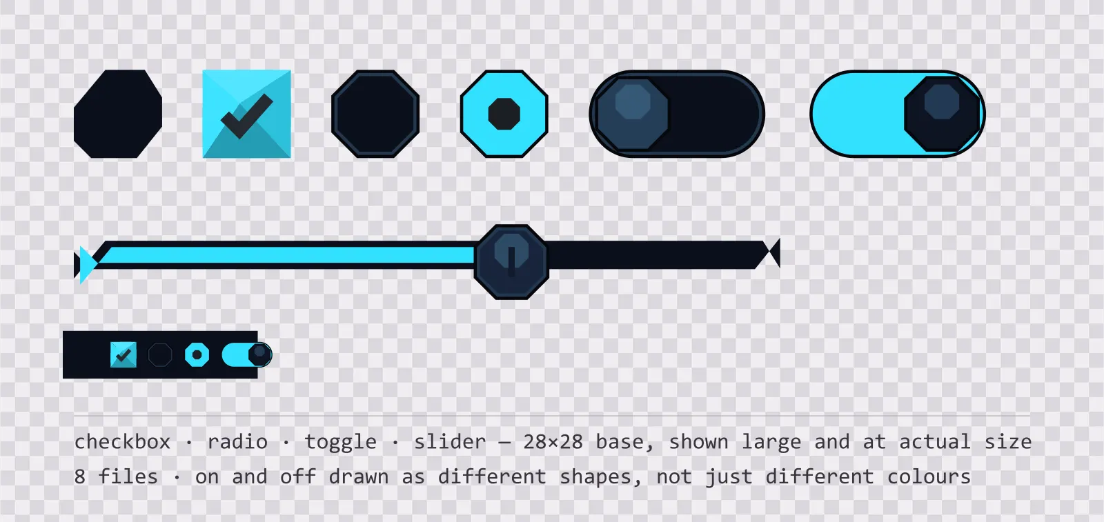
19 high-contrast neon interface controls: checkbox, radio, toggle, slider and stepper, with on, off, partial and disabled states drawn as different shapes. SVG plus PNG.
About this pack
The settings screen half of the Neon family. Chamfered checkboxes and a hard-edged toggle keep the console language going into the menu, which is where most sci-fi kits give up and fall back to a generic rounded switch.
The set covers what a settings screen actually needs: a checkbox, a radio button, a toggle switch, a slider with a separate knob, and a stepper pair for discrete values. Each stateful control ships every state as its own file at a 28×28 base — the toggle is 56×28 and the slider track is 224 px wide so it can be nine-sliced to any length. The slider also ships empty, full and vertical, because a volume column is not a rotated row.
On and off are drawn as different shapes, not different colours. An unchecked box is an empty recess; a checked one is a filled surface with a tick cut into it. That matters because a settings screen is exactly where a player is most likely to be running a colourblind mode, a greyscale shader, or a heavily tinted post-process — and a state you can only read by hue disappears under all three.
The slider ships as a track and a knob rather than a single sprite. Animating a one-piece slider means redrawing it per value; with two pieces you stretch the fill and move the knob, which is what every UI toolkit already expects. The knob carries a centre notch so its rotation and position stay readable at small sizes, and a held variant adds an accent ring for the drag state.
Disabled is a separate sprite for every stateful control, not a tint applied at runtime. An unavailable setting and a switched-off setting are different things — one says "off", the other says "you cannot touch this" — and a screen that shows them the same way sends a player looking for a bug that is not there. The checkbox also ships a partial state for the select-all row above a list of mixed selections, which is the case a two-state checkbox reports incorrectly.
Everything is included as editable SVG and as flat transparent PNG at 1x, 2x and 4x, drawn from the same six deep space blue tones as the rest of the Neon family.
Download
Direct link · no sign-up · no wait pageComplete set — 8 SVG sources, PNG exports at 1x/2x/4x, licence and readme


How to use it
- Swap the whole texture between the on and off files rather than tinting one sprite; the two states differ in shape, so a tint alone will not reproduce them.
- The slider track is nine-sliceable with a 9 px cap on each end — stretch the middle and the rounded ends stay intact at any width.
- In Unity, wire the two files to the Toggle component's Background and Checkmark graphics, or swap the sprite in an onValueChanged handler for a single-image setup.
- Keep the knob centred on the fill edge: its width is 24 px, so offset it by half that from the fill's right edge to make the handle sit on the value rather than after it.
- At 28 px these controls are sized for a mouse-driven console screen; for a gamepad menu use the 2x export and keep the hit area at least 64 px.
License
Creative Commons Attribution 4.0 — Free for commercial use. Credit required. Full terms · What this means in practice
"Neon UI Controls — checkbox, toggle and slider" by Oğuzhan Girgin, licensed under CC BY 4.0 — https://www.colorosse.com/assets/2d/ui/neon-ui-controlsAlso browse
More UI Packs
See all →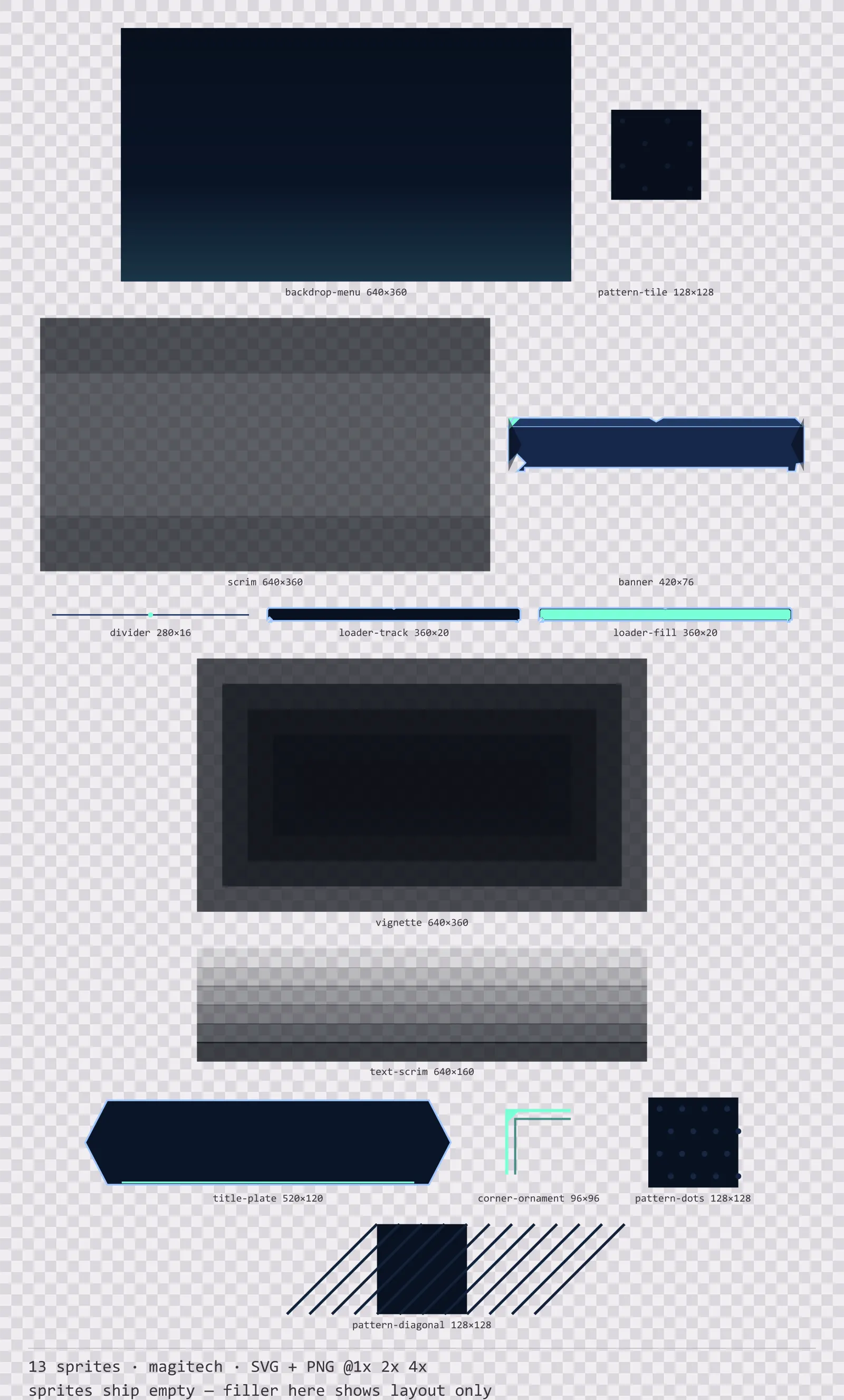
Aetherlab Backdrops
13 magitech background and overlay pieces for dark interfaces — lab navy with aether cyan accents. SVG plus transparent PNG at 1x, 2x and 4x.
Aetherlab Card Frames
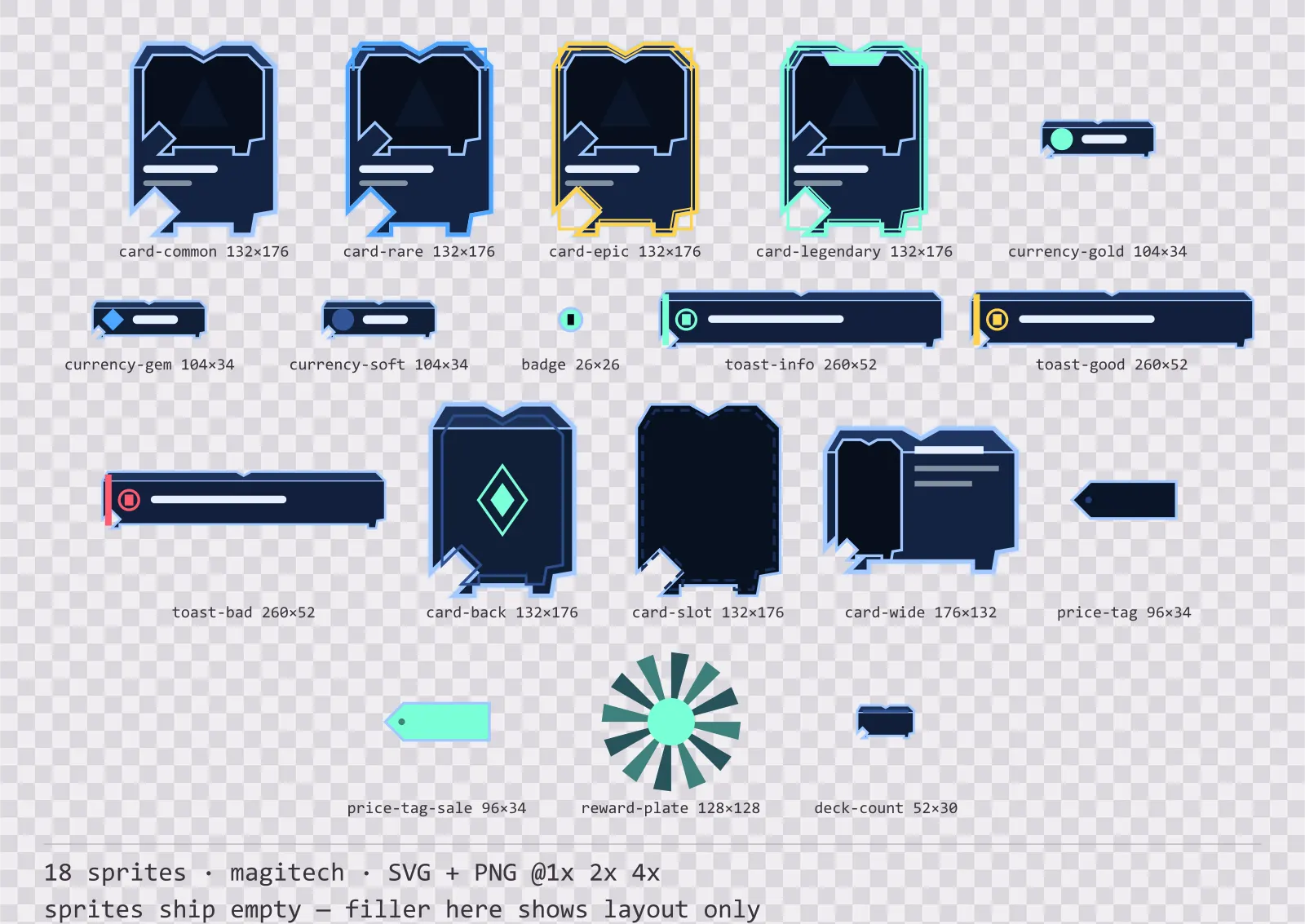
18 magitech card, currency and notification components for dark interfaces — lab navy with aether cyan accents. SVG plus transparent PNG at 1x, 2x and 4x.
Aetherlab Character Sheet
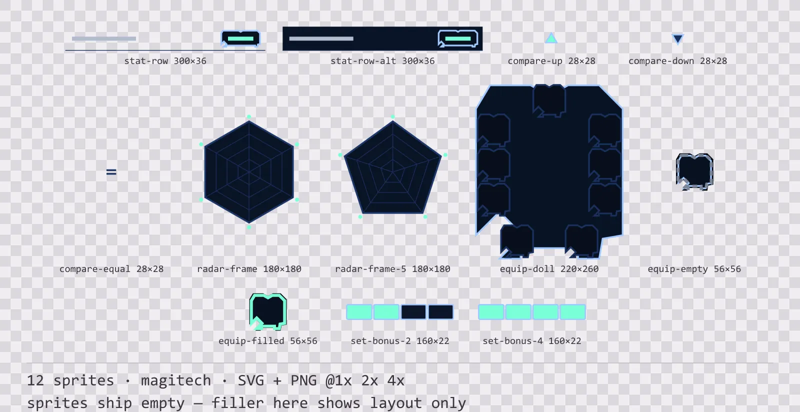
12 magitech character sheet and stat widgets for dark interfaces — lab navy with aether cyan accents. SVG plus transparent PNG at 1x, 2x and 4x.
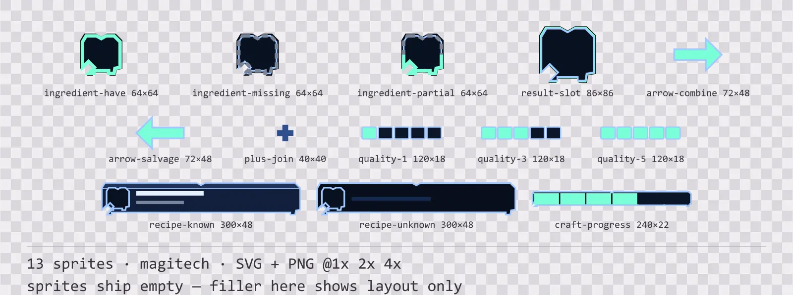
Aetherlab Crafting UI
13 magitech crafting and recipe widgets for dark interfaces — lab navy with aether cyan accents. SVG plus transparent PNG at 1x, 2x and 4x.