UI Packs
Basalt Navigation Kit
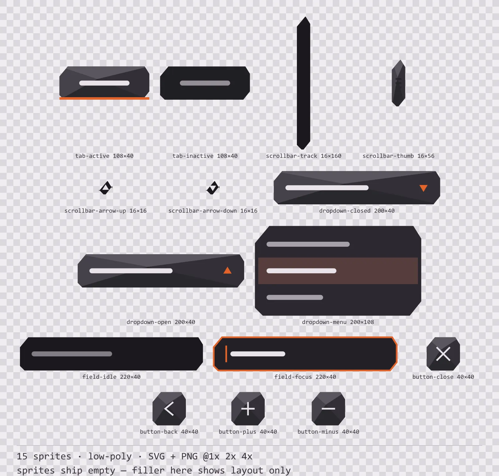
15 low-poly navigation and input components for dark interfaces — ash grey with magma orange accents. SVG plus transparent PNG at 1x, 2x and 4x.
About this pack
Basalt Navigation Kit is a set of 15 navigation and input components drawn in the low-poly style, where the silhouette is an angular polygon and the face is split into flat triangles. It contains active and inactive tabs, a scrollbar track, thumb and two arrows, a dropdown in closed and open states with its menu, idle and focused text fields and round close, back, plus and minus buttons.
Most free UI kits stop at panels and buttons, which means the first settings screen you build is the moment you start drawing your own art. This is the rest of it: the parts a menu actually needs before it works.
Four triangles meet off-centre and each carries its own flat tone, which is exactly how a faceted mesh shades. There are no curves anywhere in the kit and no gradient on any facet.
Inside that style this is the Basalt reading of it: a dark interface on a ash grey palette with magma orange accents, built around a single bordered frame, square-cornered buttons at 120x44, banded bars divided into 7 segments, and solid icons on a 24px grid. Those measurements are why two families can share an art style without being interchangeable: the style decides how an edge is drawn, the numbers decide what the interface is for.
The focused text field widens its outline instead of only changing colour, because a focus ring that is only a hue disappears in high-contrast mode and takes keyboard navigation with it. The active tab merges into the surface below it rather than just brightening, which is what makes it read as connected.
Every sprite ships as an editable SVG and as transparent PNG at 1x, 2x and 4x, so you can drop the PNGs straight into an engine or open the vector and change a colour. Built to the same measurements as the rest of the Basalt family, which means this kit and the Basalt panel kit line up without either being resized. A good fit for low-poly games.
Download
Direct link · no sign-up · no wait pageComplete set — SVG sources, PNG exports at 1x/2x/4x, licence and readme

How to use it
- Nine-slice the scrollbar track vertically only; the thumb is a separate sprite so you can size it to the content ratio without stretching the grip lines.
- The dropdown menu is a separate sprite from the closed control — draw it on a layer above everything else, or it clips inside the panel that owns it.
- Use the plus and minus round buttons as a stepper pair at the same size as the close button so a settings row keeps one rhythm.
License
Creative Commons Attribution 4.0 — Free for commercial use. Credit required. Full terms · What this means in practice
"Basalt Navigation Kit" by Oğuzhan Girgin, licensed under CC BY 4.0 — https://www.colorosse.com/assets/2d/ui/basalt-navigation-kitAlso browse
More UI Packs
See all →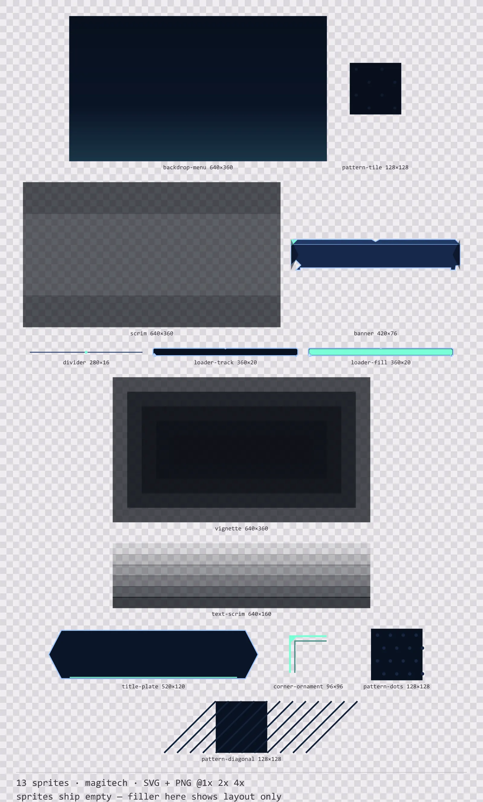
Aetherlab Backdrops
13 magitech background and overlay pieces for dark interfaces — lab navy with aether cyan accents. SVG plus transparent PNG at 1x, 2x and 4x.
Aetherlab Card Frames
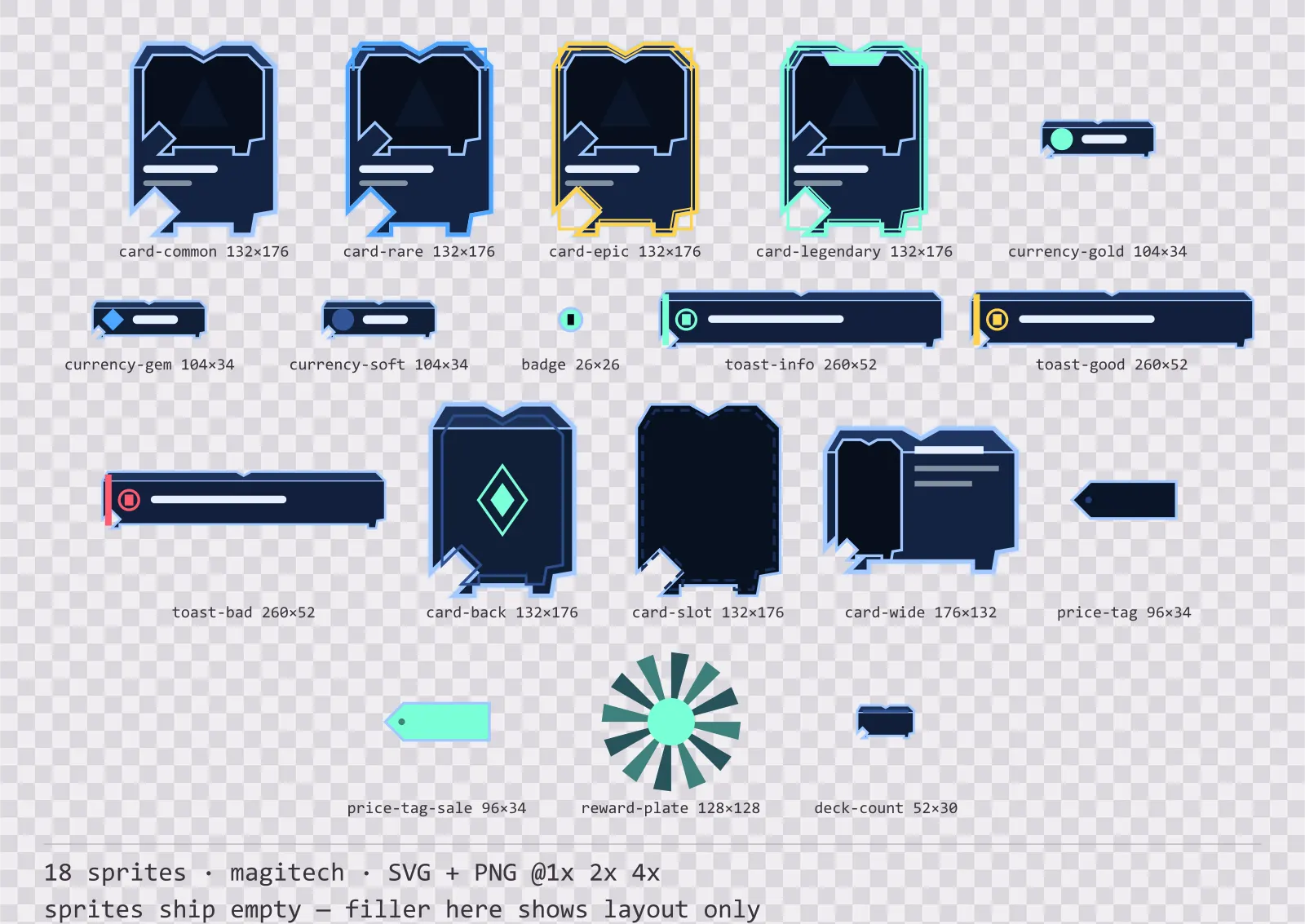
18 magitech card, currency and notification components for dark interfaces — lab navy with aether cyan accents. SVG plus transparent PNG at 1x, 2x and 4x.
Aetherlab Character Sheet
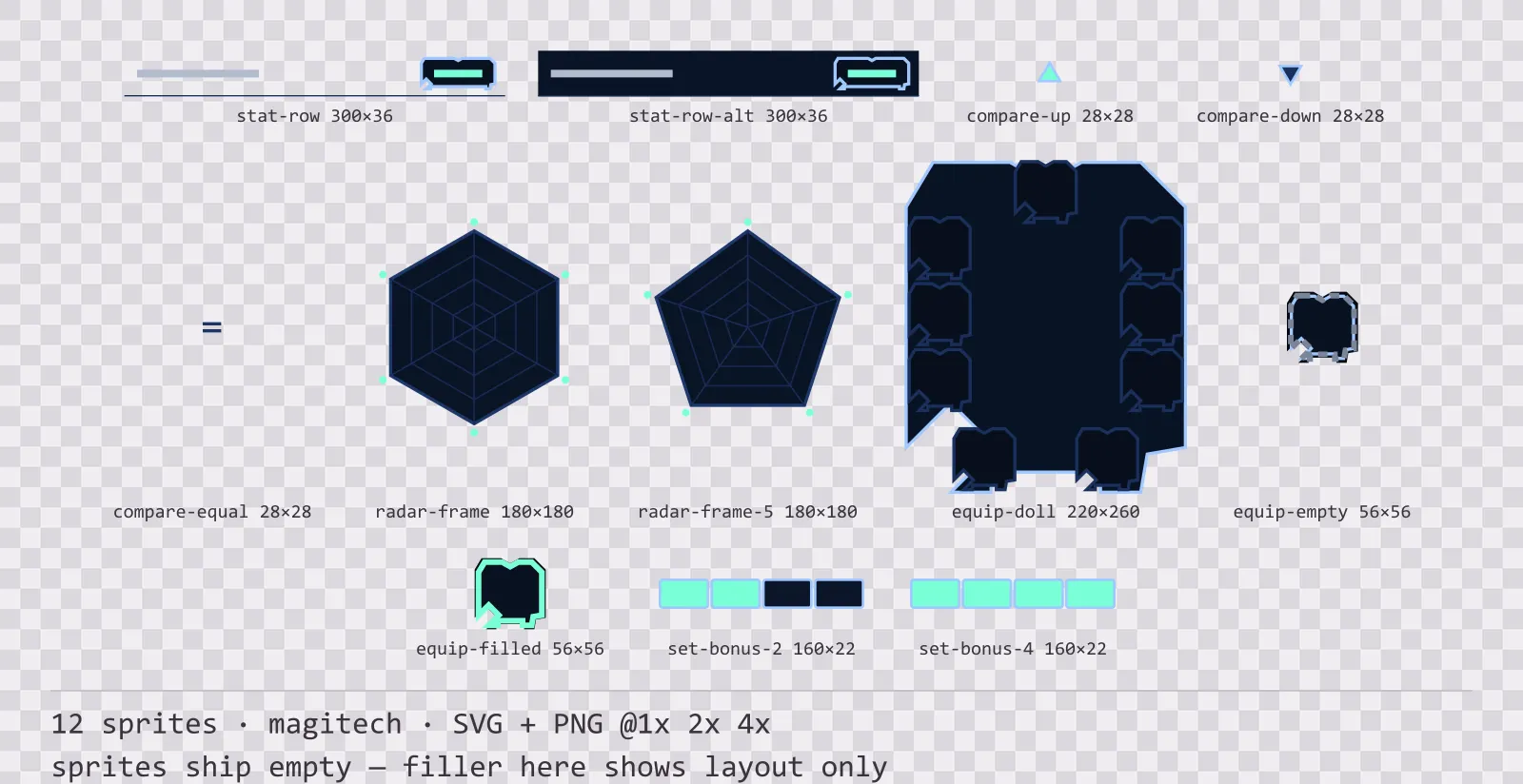
12 magitech character sheet and stat widgets for dark interfaces — lab navy with aether cyan accents. SVG plus transparent PNG at 1x, 2x and 4x.
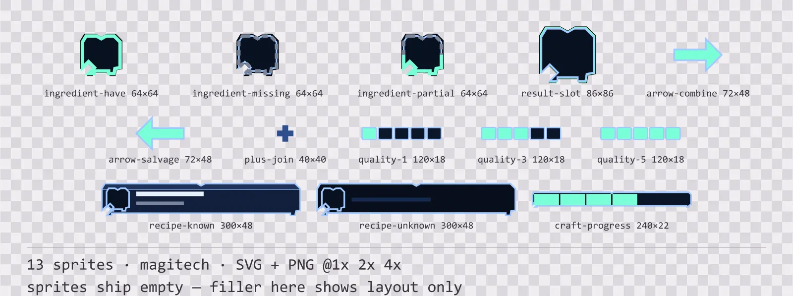
Aetherlab Crafting UI
13 magitech crafting and recipe widgets for dark interfaces — lab navy with aether cyan accents. SVG plus transparent PNG at 1x, 2x and 4x.